Hello! And welcome to a teardown of an email which I was impressed by. This marks the beginning of a series of blog posts called ‘Compelling Email Examples’ where I’ll be sharing emails which I found engaging.

Hi, I’m Lucy! I’m the Creative Ninja here at Automation Ninjas. I do all things to do with creative design.
So, my compelling email picks are always going to be leaning into being more design focussed rather than copy focused. I like it when the two of these things combine to make interesting and engaging emails, and I’d love to share some of the good ones with you.
In today’s example, I’m sharing an email I received from Thriva.
Thriva is a company which supplies home health tests - they post blood tests (with a huge menu of what you’d like to test) out to you and you receive GP reporting with your results - an excellent service! I had a kit sent out to me and this email was received on the day the kit was received.
We’ll go through the whys and the hows shortly. I’ve laid it all out in a detailed fashion - I want you to learn some best practices so if you’re looking to create more compelling emails, you’re in the right place.
And if you’re wondering how a health-industry-specific email can help you create your own compelling email, read on…
Anyone who sends marketing emails to their list will find this teardown and the further ones in my series useful.
You may think you only need to see examples from your particular industry, but conversely, you can and you should take inspiration from a wide range of industries. In doing so, you won’t look like just every other competitor on the block, you’ll have the email-edge. We like the email-edge!
Show us the email!
Ok here it is.
From: Thriva
Subject: ‘What’s in your Thriva test kit?’
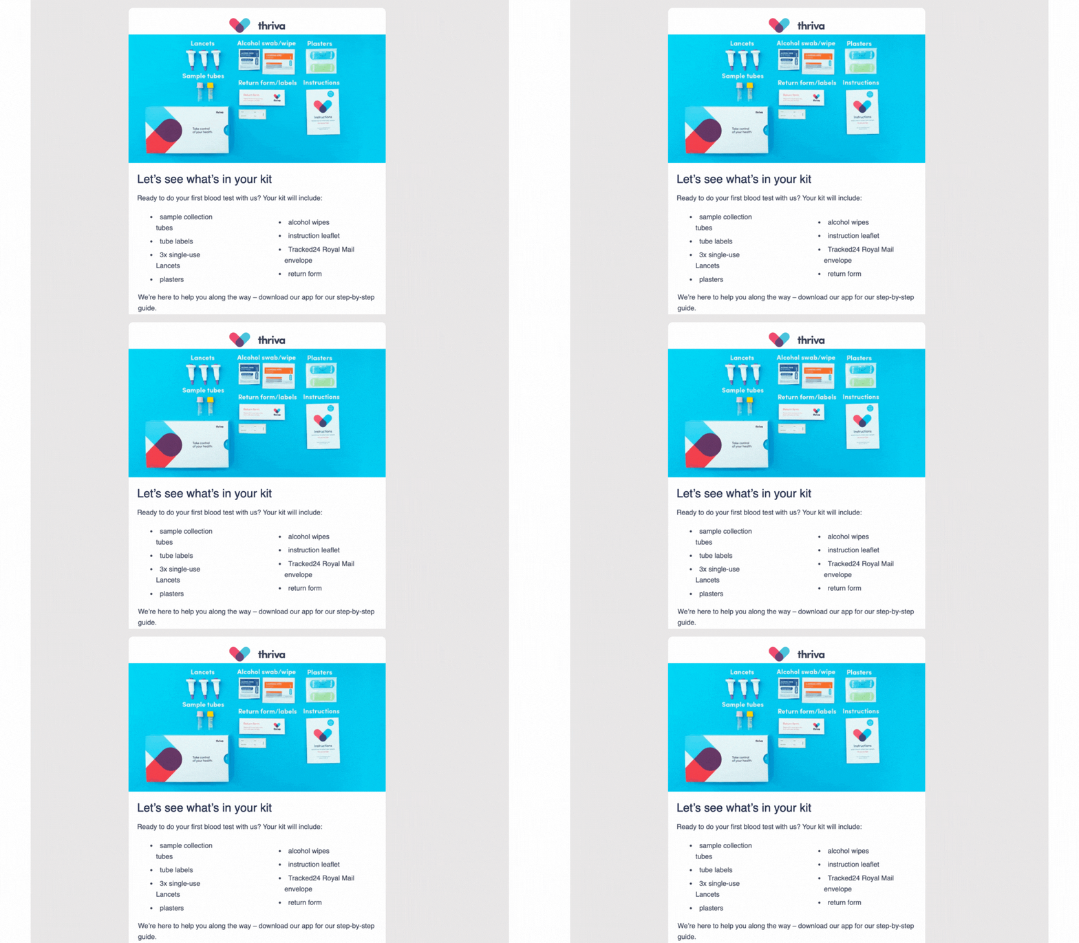
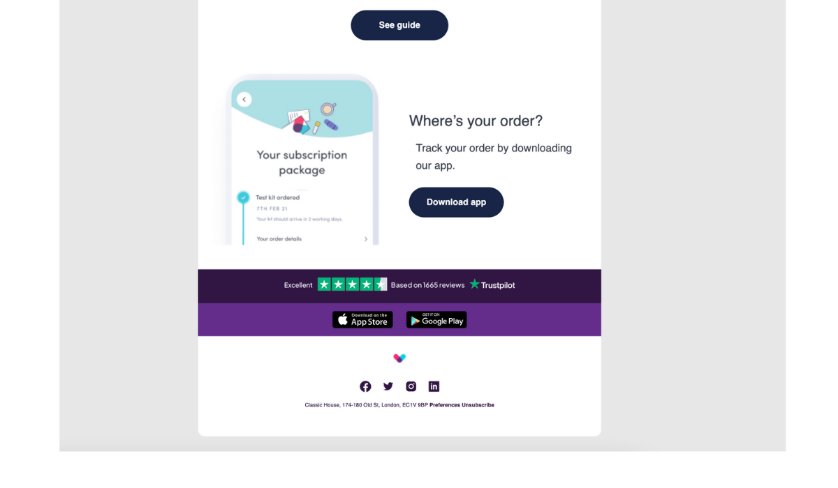
What works to make this email compelling?
The Graphics
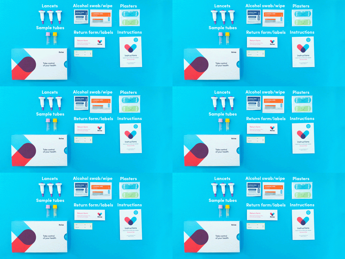
The .GIF is charming. I love that little wiggle wiggle!
Do you ever use GIFs in your emails? Is it something you could revisit if you never have or if you used to, or even if you don’t like them? Some statistics to spur you on, If I may…
- Dell’s first GIF-centred email campaign saw a 42% increase in click rate, leading to a 103% increase in conversion rate. Not to be sniffed at! (Source: Marketing Sherpa)
- According to Experian's research, 72% of email marketers that incorporated animated GIFs experienced an increased transaction-to-click rate compared to the rates seen in emails without GIFs. (Source: e-shot)
There is a time and a place for a .GIF and they can vary in terms of subtlety. (If you don’t want to create them yourself, an excellent place for finding people to make a custom .GIF for you is Fiverr.com)
Not only is that kit .GIF charming, but it’s useful. It’s a fun way of making what’s in the kit very clear. It helped my understanding of the kit and helped me to know exactly what to expect - always a useful thing for your customers to know!
Look at the .GIF, isn’t it lovely!
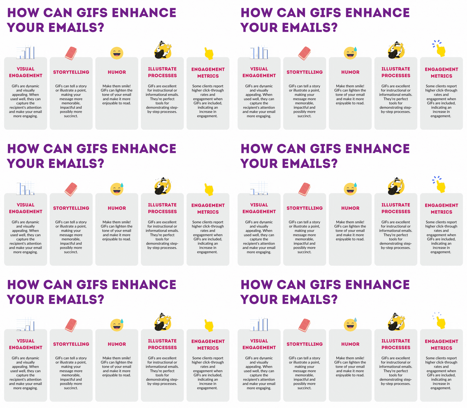
How GIFs Can Enhance Emails
Visual Engagement: GIFs are dynamic and visually appealing. When used well, they can capture the recipient's attention and make your email more engaging.
Storytelling: GIFs can tell a story or illustrate a point, making your message more memorable, impactful and possibly more succinct.
Humour: Make them smile! GIFs can lighten the tone of your email and make it more enjoyable to read.
Illustrate Processes: GIFs are excellent for instructional/informational emails. They’re perfect tools for demonstrating step-by-step processes, especially for those with short attention spans.
Engagement Metrics: Some clients report higher click-through rates and engagement when GIFs are included, indicating an increase in engagement.
Now in the spirit of keeping this blog engaging and to give you super-useful takeaways, here’s that information summarised in a .GIF!
One final word on .GIFs: always plan their usage cautiously.
Overusing them or including inappropriate GIFs can detract from the professionalism of your email and potentially annoy recipients. Always consider your audience and the context of your email when deciding whether to include them.
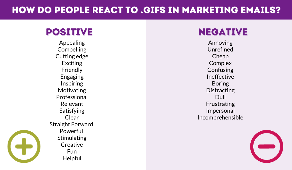
(source: Nielsen Norman Group)
Over and out on the topic of .GIFs!
A Text List
Thriva have followed that graphic with an actual list of what’s in the kit. This is important! Having a text list in this case is required.
Why? For both the people who have images switched off, and for those who need a text list for their accessibility needs.
Inspiring Action
Think about what the action is that Thriva wants people to take as a result of reading this email - either to open their test up or to not delay in doing it (an at-home blood test could easily be something someone puts off doing!).
They are clever little sausages because this email was received on the day the kit was received. This send timing must be as standard, and assuming there’s no delays to the kit deliveries, the kit will be within reach of the receiver when they’re opening their email. Marketing perfection!
And if that’s not the case and the kit has not yet arrived, it’s an opportunity to easily track their order - see that button at the end of the email. This is helpful for the receiver and helpful for Thriva for 2 reasons:
- They're pre-empting any ''Where is my order?'' emails from their customers. I imagine that this is time effective for the company. Give your customers the tools to do something themselves = less man power needed.
- They can track their order by downloading the Thriva app - anyone who does not have the app yet will be pushed to get it. More app users for Thriva!
A Quick And Succinct Message
This email is a quick message - do the kit! There’s not any waffle. There’s no fluff taking up valuable space in the email. In an email like this, that would be pointless. I respect this and I’m grateful to Thriva for making the message clear and compelling.
App Links
I imagine that for some who don’t yet know that Thriva has an app, perhaps scan-readers of this email, and customers who ordered online rather than through the app itself, those two App links sitting at the very end of the email will bring the app to their attention
Seeing the Apple App Store/Google Play Store logos looks impressive - it elevates the brand in the mind of the consumer and it compels people to download - that could be the trigger people need when email scanning to download the app. (And it’s useful! The results show in a lovely way in the app).
Social Proof
I really like their Trustpilot email footer, it’s showing their star rating and looks like this is a widget which auto updates, very clever!
User Experience On Desktop And Mobile
Here’s what it looks like on my phone - pretty good! No different to the desktop version.
Often, mobile view is not tested in the email sending platform and things can look skewed, images blown out and - god forbid - text not reading in the order it was intended. All good here!
GIFs are both mobile and desktop friendly and they load significantly quicker than video.
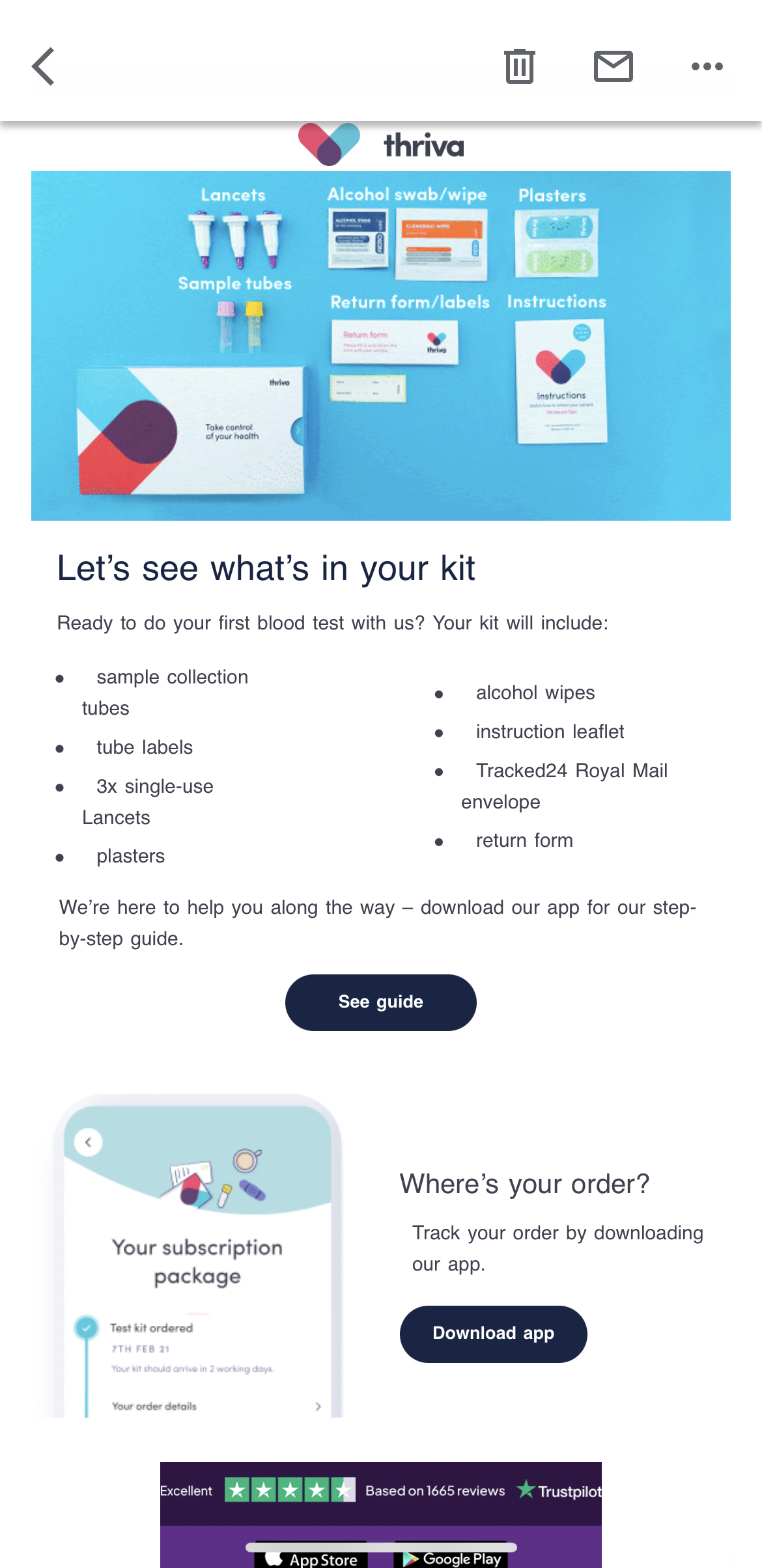
Logo included
The brand is elevated again by including the Thriva logo throughout the email - and in a subtle way too.
I can see it dotted about; it’s in the email header (in full - graphic logo and text), in the footer, three times in the .GIF showing what’s in the kit and in the ‘subscription package’ graphic. The branding is strong and coherent.
Social Links
It’s a bit boring, but social links should always be included in your emails as standard. Though their LinkedIn logo didn’t work! It just opened up the image. Oopsie Thriva. Test those social links!
Clear Calls to Action
So the action is to do the kit, but also to see the guide if people want more information (the info is included in paper form in the kits, so this is an extra). They’re making the kit info very accessible for their customers.
When clicked, the button takes you to login to your Thriva account to see the guide. So there’s a step to take here, but I imagine they need to gatekeep that content, so fine. Fine!

Now there ARE a couple of things that Thrive could have done better. They’re little things, I imagine most would not notice them, but as a lover of detail, let me quickly run through what I did notice…
How Could They Make The Email Better?
- A break between logo and image would be nice. I get that they’re trying to get as much as possible ‘above the fold’ but a tiny bit more of a gap would add more balance.
- The alignment of the bulleted list is off - the indentation makes the text look wonky and a little jarring. Not sure if there would be a fix for that, but it does irk me a little!
- There is an orphan word: ‘guide’ in this sentence: “We’re here to help you along the way – download our app for our step-by-step guide”. This would have looked nicer in the email if it was either all on one line or went further into two. It would help it read better for scan-readers.
- I wonder, does it need to have a grey background? For me, that grey colour doesn’t add anything to the email, but it’s likely a branding choice for Thriva.
That’s it.
As I said, tiny things! The email is excellent, good job Thriva!
So To Sum Up… Make Your Email Compelling By:
- Including charming/useful/fun graphics
- Make your email useful
- Inspire action and make the action clear
- Where appropriate, write succinct content
- Cater for accessibility and those with images switched off
- Impress and elevate with your branding
- Include social proof
- Test on desktop and mobile
Happy compelling email crafting!
I hope you’ve found this useful. If you enjoyed this blog and want more, read more of my ‘email teardowns’ - click here and you’ll see all my Ninja blogs which are mostly written about excellent examples. Lots of detail, lots of screenshots, lots of value.
This is the first instalment in my Compelling Email Examples series. So, if you enjoyed it - stick around and keep your eyes peeled for more email teardowns.


