Whether you currently send an email newsletter, or you’re thinking about creating one for your business, I think it would be super valuable for you to look at some examples of email newsletters to get a feel of what works and what doesn’t.
In this blog, I will be sharing three newsletter examples that people I know love to receive.
These examples are not perfect. I’m not going to be glorifying them, I’ll be honestly critiquing them. This in depth analysis which will help you to tangibly see what the best practices are and what rules you should follow to get a top-notch email newsletter out there in the world.
In putting together this blog, it’s highlighted to me how newsletters can be massively different. It’s not a case of one size fits all, because in a way, some rule bending works wonders.
Let me briefly touch upon what newsletters are… and what they are not.
Newsletters are:
- A medium for providing high value and insight driven content
- A regular form of communication that focuses on interests of the reader
- A great way to showcase your expertise and build trust in your brand
Newsletters are not:
- For hard-selling your own products and services
- Just a quick roundup of your blog or website content
- A place for you to boast about your company
Your newsletters can contain a variety of things. That variety might be vast (creating a real chunky newsletter) or it might be boiled-down (and very short).
Some of this variety could be: industry news, a new tip you discovered, a picture of the month, joke of the month, website of the month… anything. I wrote a whole blog with some more of these tangible email newsletter content ideas - read it here.
Newsletter mistakes to avoid:

Tempting as it is, newsletters shouldn’t really be about shoving links to all your content into an email.
Yes, your audience may want to read some of your recent content - but do they want to read all 12 pieces of it??
Newsletters which have the scales tipped more towards sharing external content feel much less ‘Me! Me! Me!’ than when tipped more towards sharing in-house content.
You should be linking to external content - e.g. articles, books, podcasts, videos… This should all be content which shows your readers that you’re really ‘IN’ the industry and that your insight is an interesting one.

Yes you might have a fantastic sale on or a new programme which is open for registration, but if you make this the linchpin of your newsletters, it’s not very nurturing - and newsletters should be all about the nurture.
Perhaps you could include PS to remind them of an offer - ok go on then.
Show you care, sell elsewhere!
If people just feel sold to, they won’t like it, and the relationship won’t be built. We’re looking to build trust with our subscribers.
The more trust that’s built, the more people will be jumping in line to purchase your fantastic new thing when you tell them about it - just you watch.
Newsletters can be such a hard thing to get right.
Many businesses will find it difficult not to share brilliant content which has already been created in-house; or talk about achievements and highlights from a company perspective; and most will likely feel it’s a mistake to avoid sales - thinking it's a missed opportunity…
So for the sake of showcasing why we say not to focus on these things, I’ve called out one of the newsletter examples where the balance is off.
Show me the email newsletter examples!
I wanted to deliver you a real mix of newsletters examples, so I put the feelers out to my friends and family -

And boy were they hot off the mark in response to my question.
Each of my beloved people only had only 1 or 2 to recommend to me, but I could tell how keen they were to share those 1 or 2. There was passion present for these favourite email newsletter of theirs, and they came to the front of their minds immediately.
I’m going to run through two of the email newsletters they recommended to me, and the third example will be one of my own personal favourites.
I’ll point out exactly what it is that makes these real-life examples of email newsletters special, alongside some tips for improvement too. I’ll also show you the sign-up forms to each, because that’s where it all begins, right? That’s your first opportunity to really nail your newsletter strategy.
I hope you enjoy my rundown, it’s been a fun thing to collate 🙂
Shall we start with a running newsletter?
On your marks… Set… GO!
Email Newsletter Example # 1
The business I’m looking at is The Marathon Handbook.
What is the newsletter sign up form like?
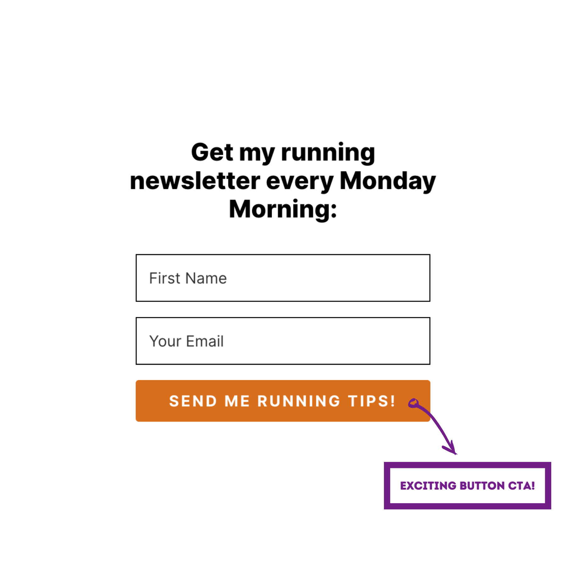
I like this a lot! Yes to sending me running tips, that’s a fab call to action. The form is simple, and I like that it’s clear to me it’s sent weekly, on which day of week, and around what time. I like that precision.
What’s the newsletter content like?
Subject line
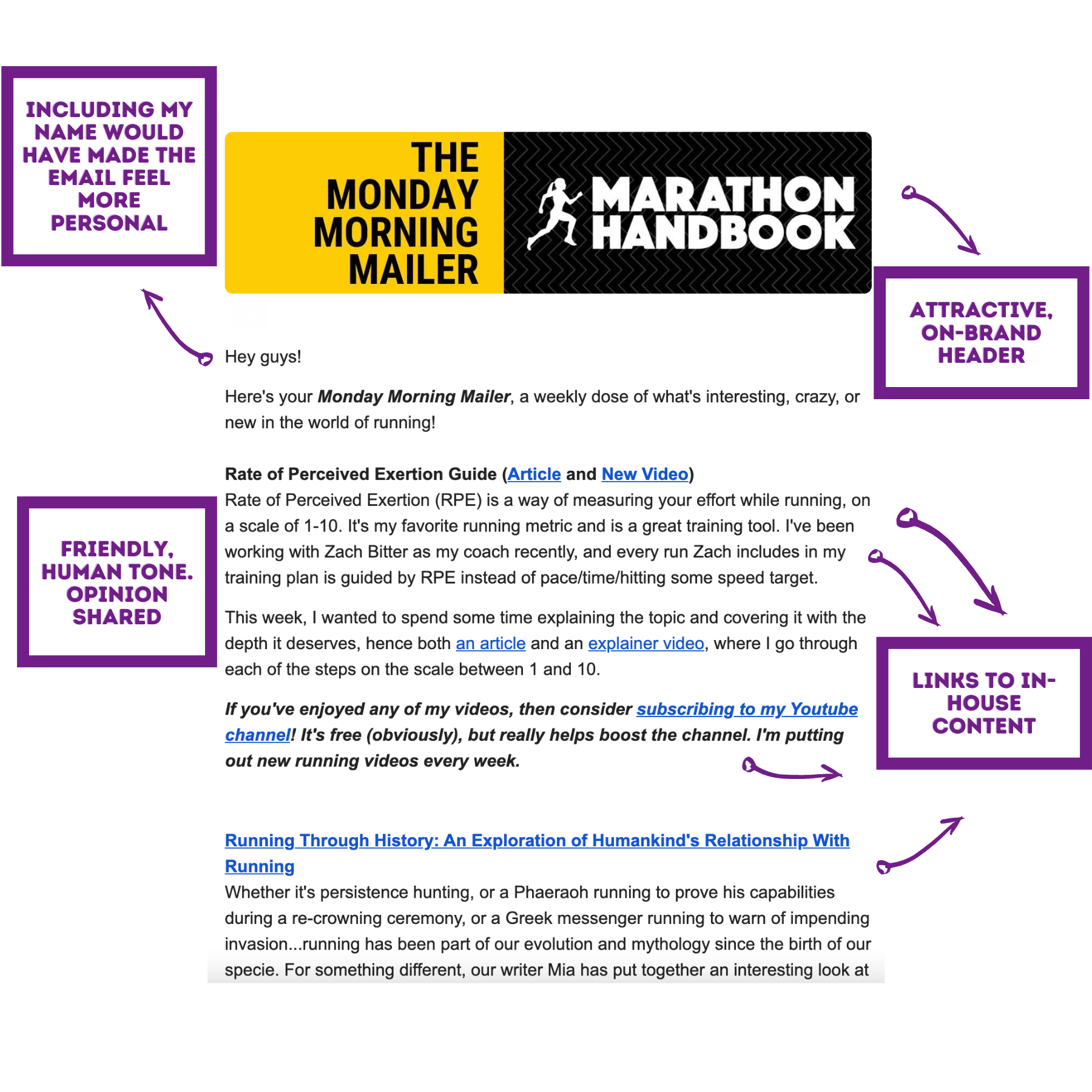
I love the subject line for this newsletter. Simple is often best! Having that ‘series name’ makes it stand out in the sea of emails in an inbox.

Though I think they could have utilised the ‘preview text’ and included the start of something juicy in there to encourage people to open - giving people a preview of the content, e.g: ‘New month, new pace’.
How personal does it feel?
There isn’t any personalisation. It’s just ‘Hey guys’ at the beginning and ‘Have a great week guys’ at the end - this is truly missing a trick as my first name was collected on the form I filled out when subscribing.
If you’re asking for it, why ain’t you using it?
The email is sent from ‘Thomas at Marathon Handbook’ - so top marks there. It’s important to send your newsletter from a real person if you’re looking to build trust (or even the team if you need to, but from ‘the company’ feels a bit cold).
Plus, I really recommend including an image of yourself in the signature - to really up the feeling of a personal, trusted interaction. Show us your face Thomas!
How much ‘me me me’ content is there?
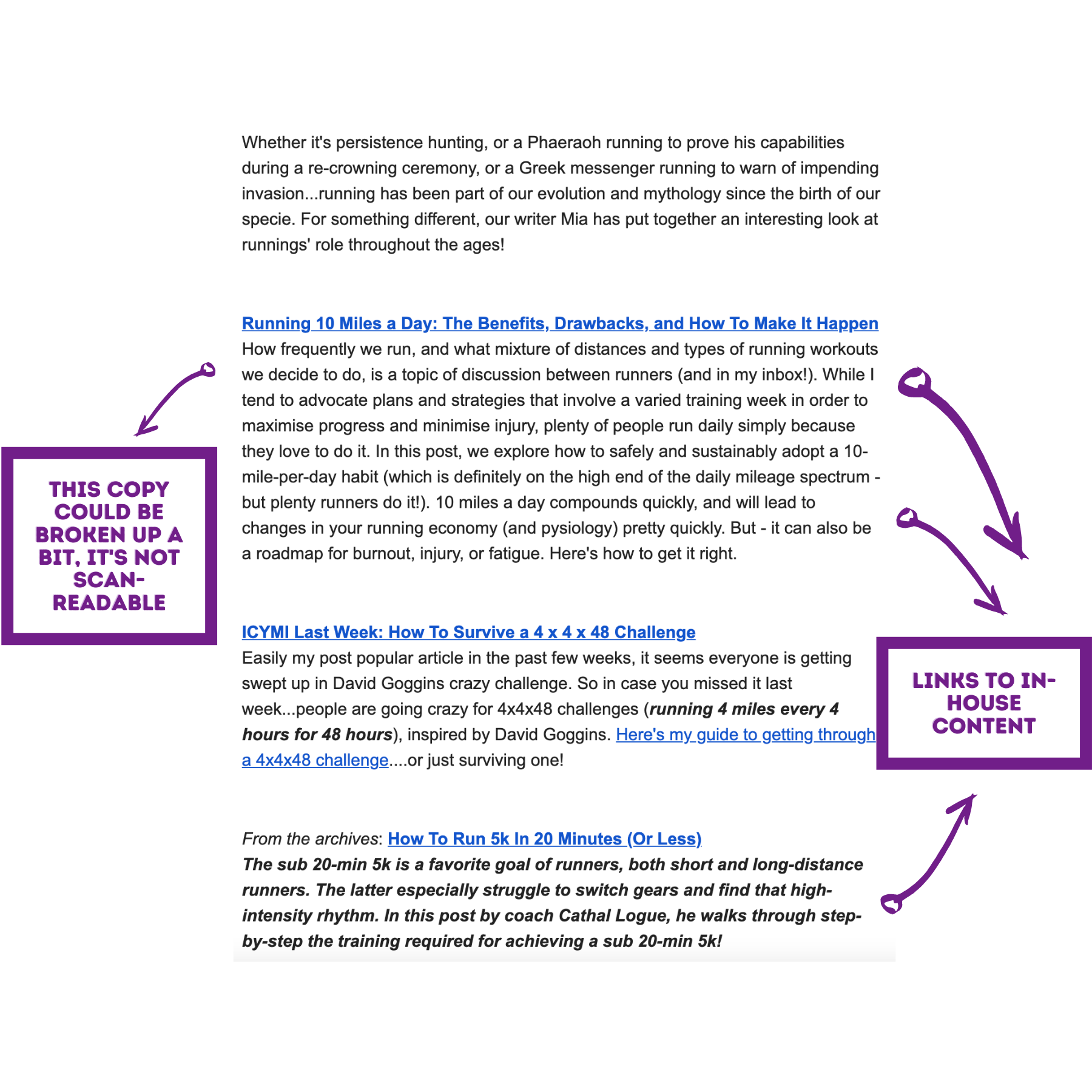
I mean, there’s tonnes. There are zero links to any content not created in-house.
And I don’t like that.
I get the feeling that the content these guys are creating is stellar. I get it, I do, but it’s a real bombardment of links which take me right back to the Marathon Handbook website.
Now I’ve got that off my chest, the good thing is that the copy they’ve created in this email is great - it entices me to read. They are educating me, I’m learning things, enhancing my running life - this is exactly why my friend subscribes to this newsletter.
I also really like how it’s written in the first person, and Mr. Marathon talks about his own training and his own coach within the email. Nice and personal!
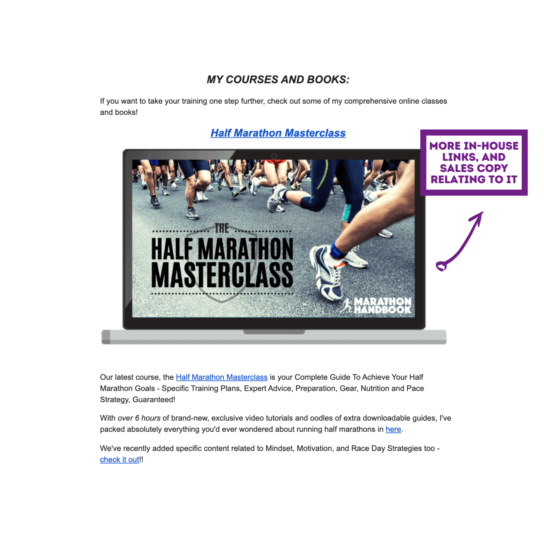
Sales pitches
Eek… again, too much. The saving grace here is that any sales talk isn’t present until the main content of the email is complete (this section is after the PS’s).
…...But there’s not just the one masterclass….
There’s 2.
And a playbook.
And a 7-day challenge.
Plus 3 books
And all those things are for sale, it’s all paid for content!
That’s toooooooo much and it feels a little icky 🙁
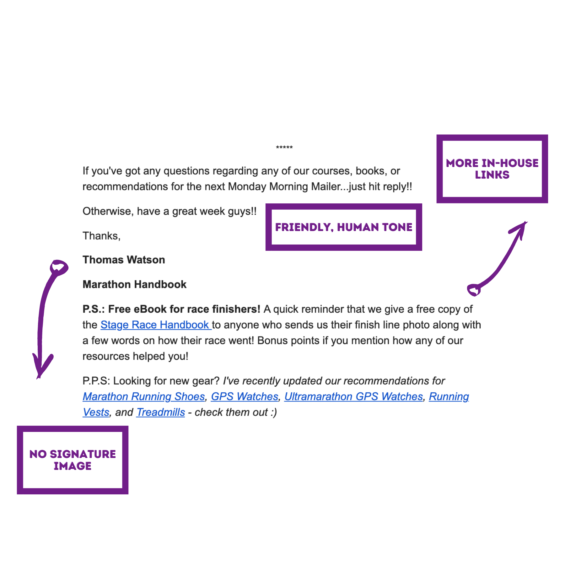
Is the content brilliant? Does the writer come across as an expert?
Yes. They clearly have some expertise to share. The email content is engaging, exciting, and I imagine it ticks ‘marathon-types’ boxes! The articles they are sharing are excellent.
Though I am begrudged to say this ‘cause they’re sharing too much of it!
Is there structure?
Kind of, but the content could be broken up a bit better visually - introducing more headers (in the brand’s colours) and images.
The only image (aside from the giant sales pitch at the end of the email!) is of the video of the week. I’d like to see some more images/graphics.
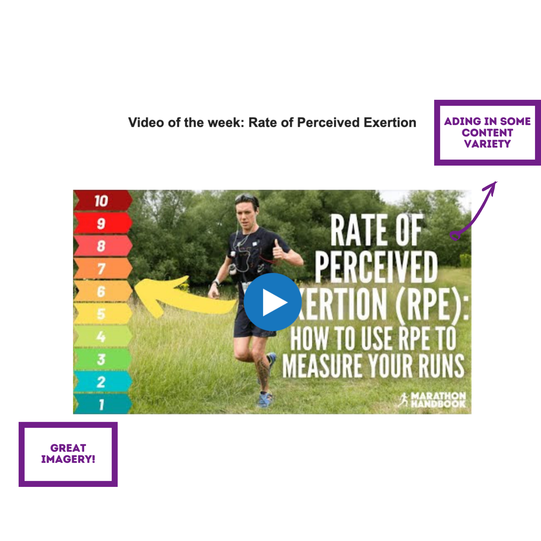
I like it when people include videos in email, and especially when those videos are clearly recognisable as videos - and the play button overlaid on the image does just that. Nice.
This is a great content section of the weekly newsletter - I’m even going to let them off the fact that it’s another piece of in-house content here!
That’s the end of my first critique. I can really see why my friend loves this newsletter and looks forward to it each week, but it was far too heavy on the inbound links. Excellent things to link to, yes, but the balance is way off.
On to the next!
Email Newsletter Example # 2
My second example is the newsletter from Grace Alexander who runs a seed company. I’ll let her introduce herself: “I am a consultant clinical psychologist, a writer, a flower grower and a seed merchant”.
This is a very unique newsletter. It stands out - and there’s a lot to learn here about how getting ultra-personal and minimal can really work.
What is the Newsletter sign up form like?
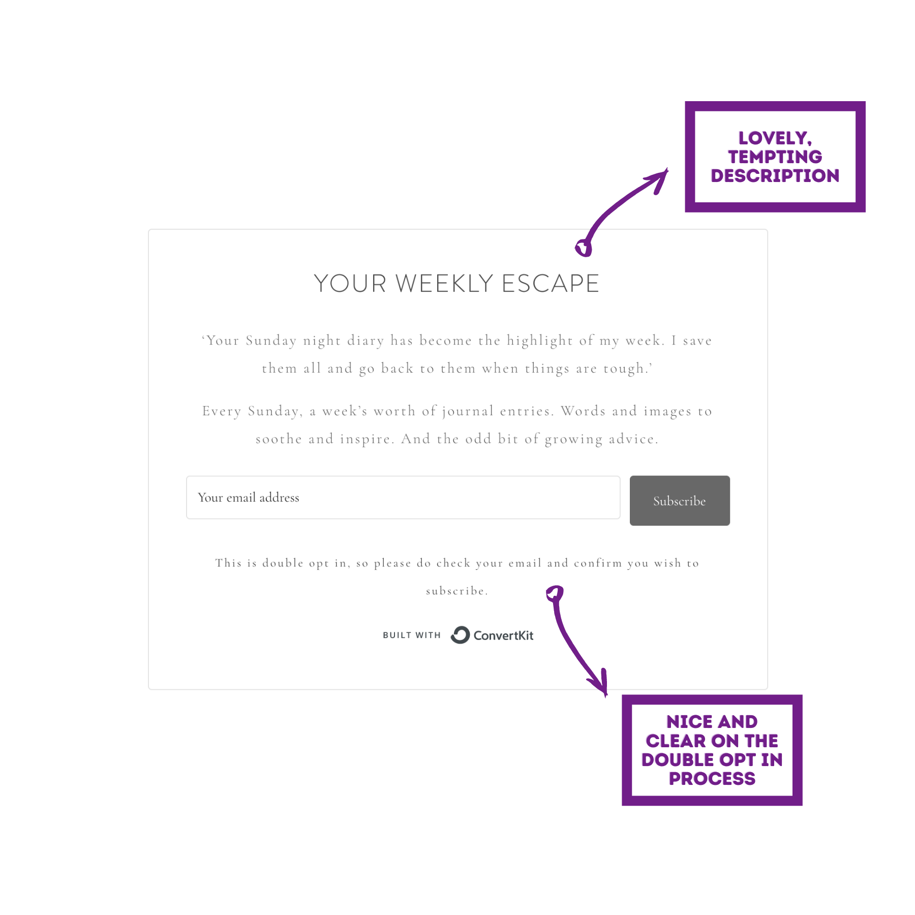
Wow, this kind of blew me away a bit.
It’s such an interesting premise - I love the description of “Your weekly escape”, how she sets the scene up so you know exactly what you’re signing up for.
Logistics-wise - a weekly email, delivered on a Sunday.
Content-wise - journal entries, inspiration and some growing advice.
Lush.
I notice that there’s no asking for my name alongside email address - which is a shame, as without asking for a first name, emails cannot be personalised.
What’s the newsletter content like?
Subject line
Half of me loves it because of the intrigue, but it’s irking me that there is nothing in that subject line to differentiate it between the other emails Grace sends. I’m assuming that there are other occasional emails which are sent from her to the list - not many people send only a newsletter.
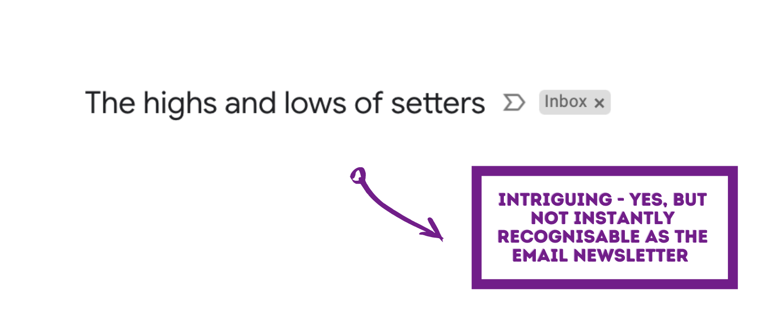
Adding in a precursor of [Weekly Escape] or [Sunday diary] would help her weekly email stick out in my inbox.
The ‘preview text’ has not been utilised, and we know how adding in some copy there further encourages people to open that email.
How personal does it feel?
Because of the content - which is simply that she’s sharing her journal entries from the week, it’s incredibly personal.
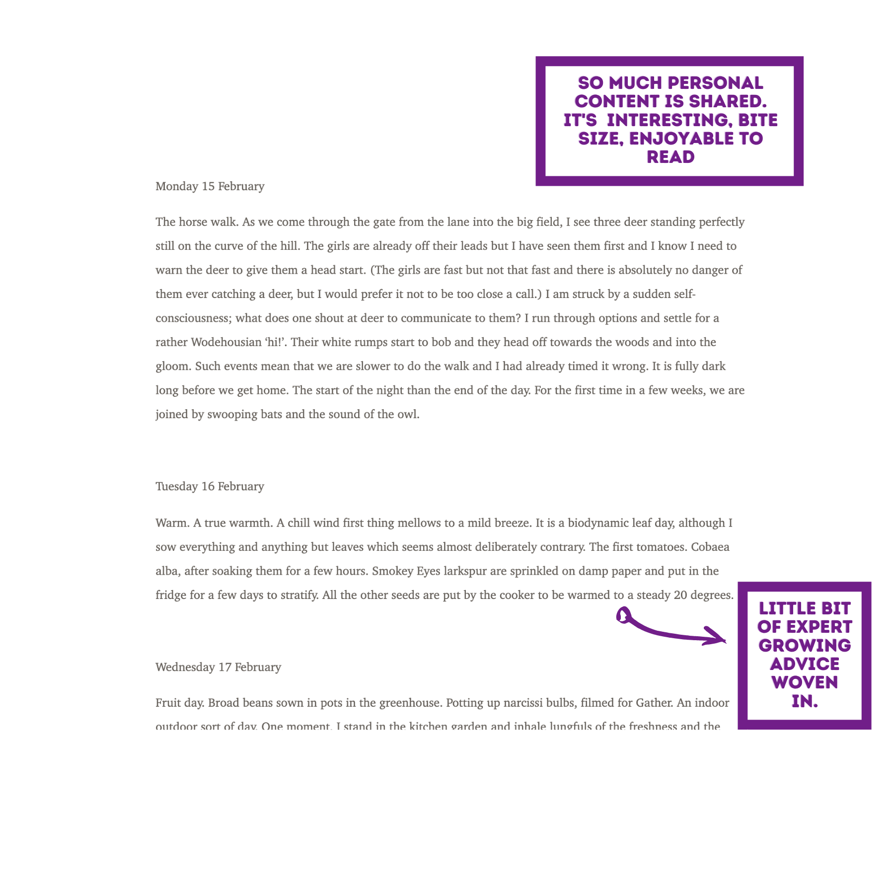
It’s a window into her world. The email is also sent from ‘Grace Alexander’ - which feels very personal (as opposed to using a business name).
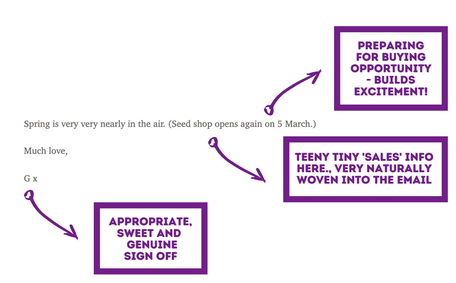
Her sign off is “Much love, G x” - that strikes me as so lovely and intimate.
But one thing is missing for me - I’d love to see an image of her, to really up the personal feel. I want to see your face Grace!

Dont be shy
How much ‘me me me’ content is there?
This is an interesting one, as the content of her weekly email is her journal entries, so it’s very heavy on the ‘me me me’!
And that’s what makes these emails special.
I slated the Marathon man for this. But for Grace… it just works. I’m bending the rules!
The content is hugely catered to her audience - remember that they signed up for “Every Sunday, a week’s worth of journal entries. Words and images to soothe and inspire. And the odd bit of growing advice” and that’s what they’re getting.
The parting line of ‘Seed shop opens again on 5 March” is the only mention of a buying opportunity in the entire email. Look how subtle it feels and how little pressure there is. I already feel a pang of trust towards her.
Is the content brilliant? Does the writer come across as an expert?
There is some subtle and gentle growing advice inside her journal entries. Including that growing advice in this gentle way, (rather than your classic ‘step by step guide to planting tomatoes’ content I imagine a lot of seed sellers put out there), is very much the way her audience wants to consume this advice.
It’s true information about how she does her own planting - and that is the perfect way to position herself as the expert.
Is there structure?
Well, yes - in that the journal days are heading up the actual journal entries. But the typical email newsletter structuring we recommend isn’t there, because this is such a different style of newsletter - the sparsity works in its favour.
I just had a good ponder about what else is missing from this special little newsletter...
Some ideas:
- I wish there was an email header image.
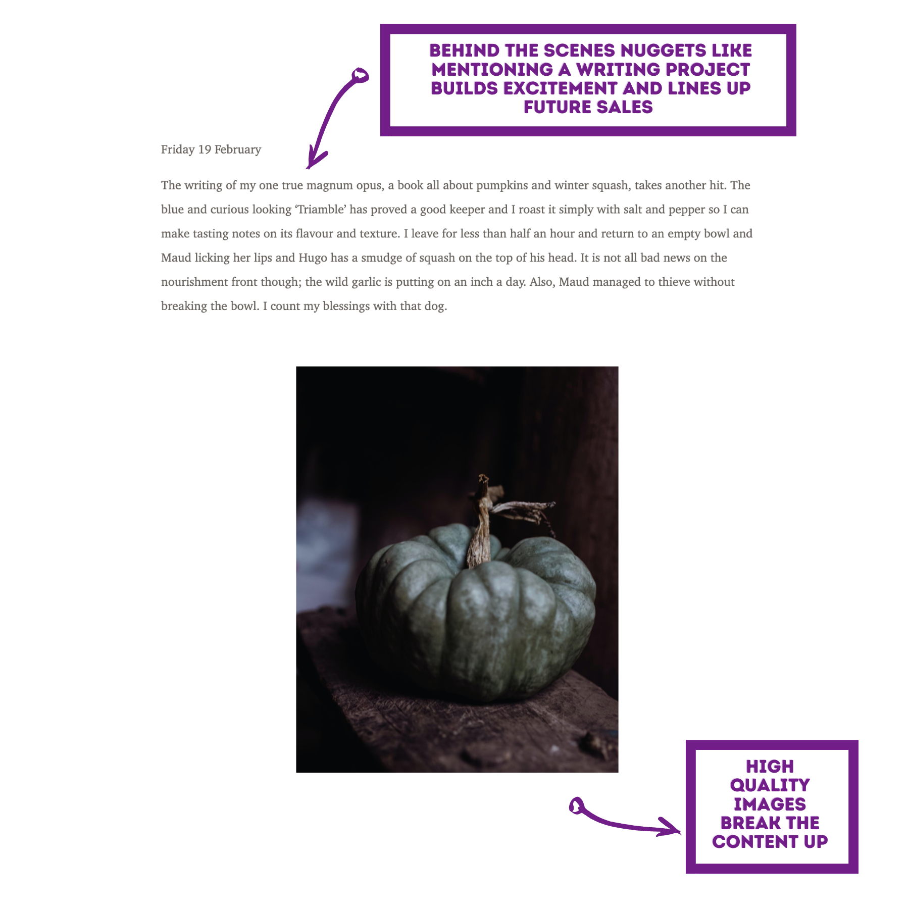
- Would a content area of ‘this time last year’ be appropriate? She could link back to her website to previous journal entries… Currently there are no links to her site in this newsletter, which is a missed opportunity.
- A ‘What to plant now’ content section would up the ‘expert’ feel, give her readers some useful information, and could still be very on-brand with lovely descriptive copy and imagery which continue the dreamy tone of the rest of the newsletter - alongside lining up the reader to buy those seeds when they’re available.
I loved this esoteric example of an email newsletter and I hope you take inspiration from it.
Email Newsletter Example # 3
Right people, it’s time for my personal example - I blinking love Courier I do.
Courier talks about businesses - mainly setting them up - by way of lots of case studies as inspiration of how to do it well. They share skills, talk about happiness and getting the best out of yourself and your work… a how to be your own boss kind of thing.
I subscribe to their quarterly magazine (an actual, physical magazine posted through my letterbox - how old school!) and their weekly newsletter email. I love their newsletter so much that I make time to read it, or file it for later in it’s own little folder in my inbox.
And it’s goooood. I’m excited to share it with you and talk about why it’s so great. Let’s jump in together.
What is the Newsletter sign up form like?
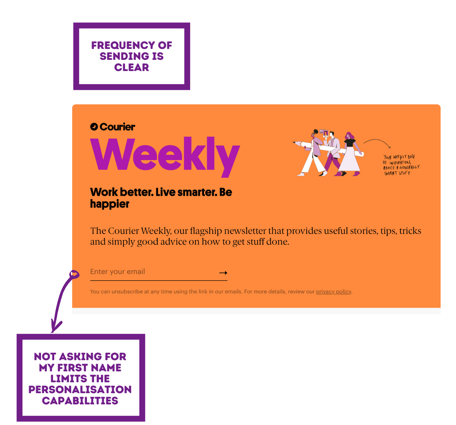
Bright, bold and colourful - the sign up form for Courier’s weekly email is perfecto.
That graphic on the right is great: "Your weekly dose of inspiration, advice and generally smart stuff" it says - this is all stuff I want!
The company tagline of “Work better. Live smarter. Be happier” is present in this sign up form, which is a nice addition too.
The main copy on the sign up form is this: “The Courier Weekly, our flagship newsletter that provides useful stories, tips, tricks and simply good advice on how to get stuff done.” It’s important to let your prospective sign-up know the frequency you’ll be emailing them - tick.
What’s the Newsletter content like?
Subject line
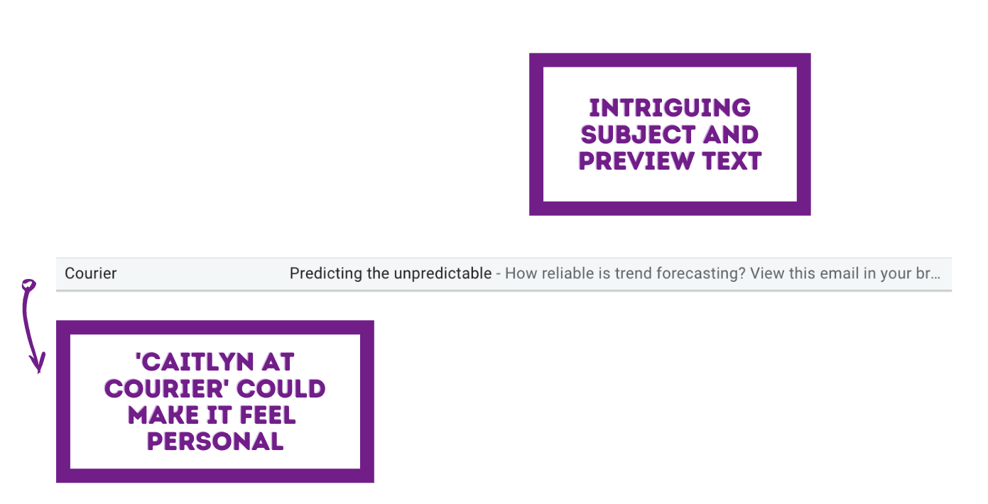
Just like with the previous example, I wish there was a [Courier Weekly] bit in the subject line.
Sometimes the problem is that if you make a subject line too long, it won’t all show on mobile (which is a great reason to make sure you’re utilising the preview text area when sending out email). But again, it’s a handy way to differentiate between emails the company sends, and to make the email series instantly recognisable in the inbox.
We’re all drowning in email and things can easily get lost, right?
How personal does it feel?
Courier didn’t ask me for my first name - bummer. Again, this limits the opportunity for personalisation in the emails they send.
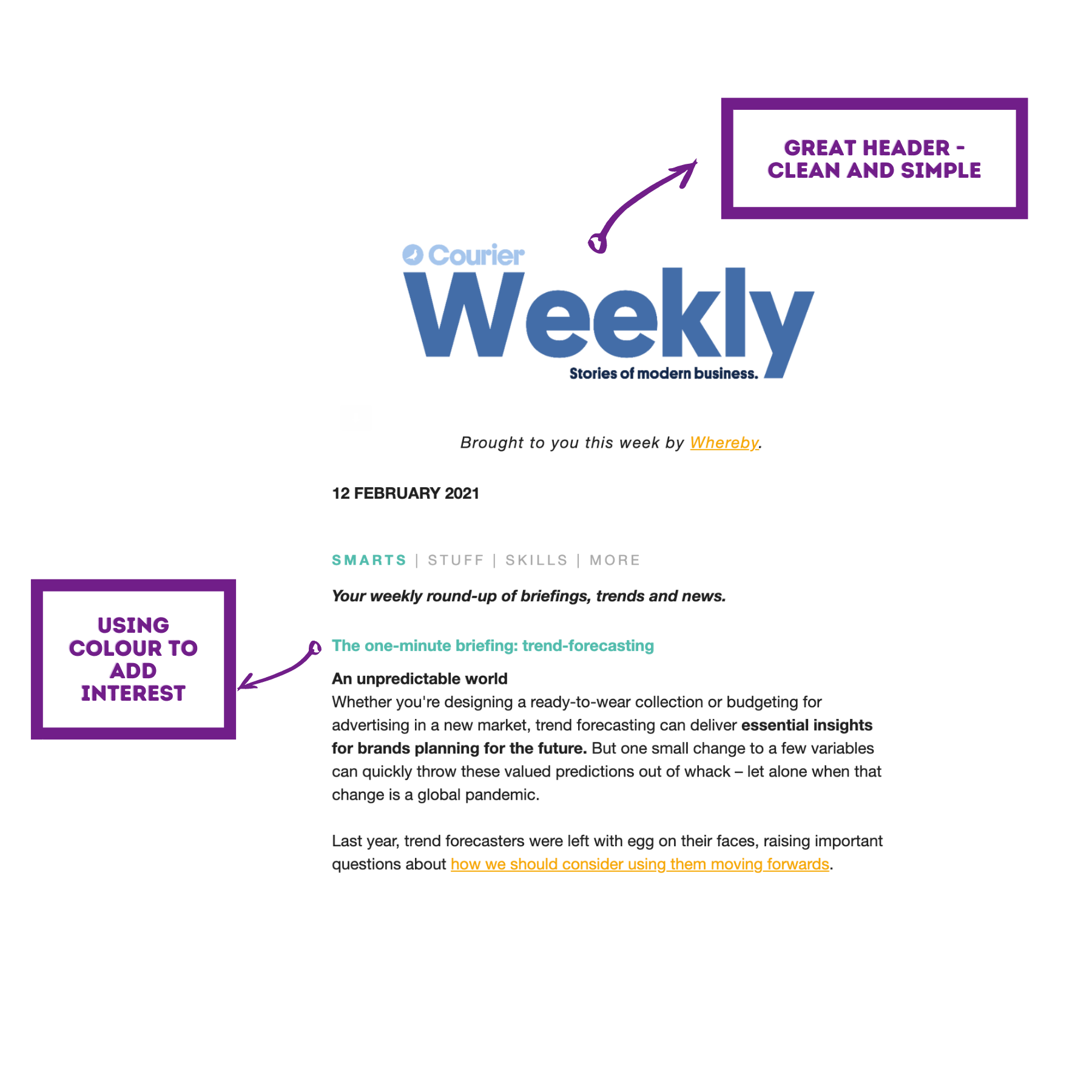
The email is simply sent from ‘Courier’, using the email address ‘hello@’ rather than a person at Courier. If you compare the experience of receiving the email from a person vs the company as a whole, there’s quite a difference to how personal it feels.
The newsletter also contains no signature - nothing at all, in fact there isn’t even a sign off, which feels a little bit weird.
The content just stops. Slap on the wrist Courier!
If I imagine a nice smiley image of, say - Caitlyn (who could even be a made up team member at Courier, a lot of people make someone up!) at the end of the email, and a personal sign off from her, it would feel a lot more personal and real.
How much ‘me me me’ content is there?
Courier create a lot of content.
They will be tracking links (well I hope so anyway!), as every click is an indicator of the reader’s interest.
Gathering valuable information like this on your list is marketing gold dust.
Why? Well, imagine someone clicks 10 different content pieces on the topic of productivity within 6 months. What you could deduce from that?
- Depending on how many others click on this topic, it’s possibly a high-interest topic for your audience, and content should continually be made about it.
- If you were to release a product relating to productivity, this happy clicker will be much more likely to be first in line to purchase, compared to someone who’s never clicked anything related to the topic of productivity.
- Segmenting your list so that the sales emails for this productivity product are pushed ‘harder’ to those with a productivity interest, because we know they’ll be receptive in it, will likely lead to more sales.
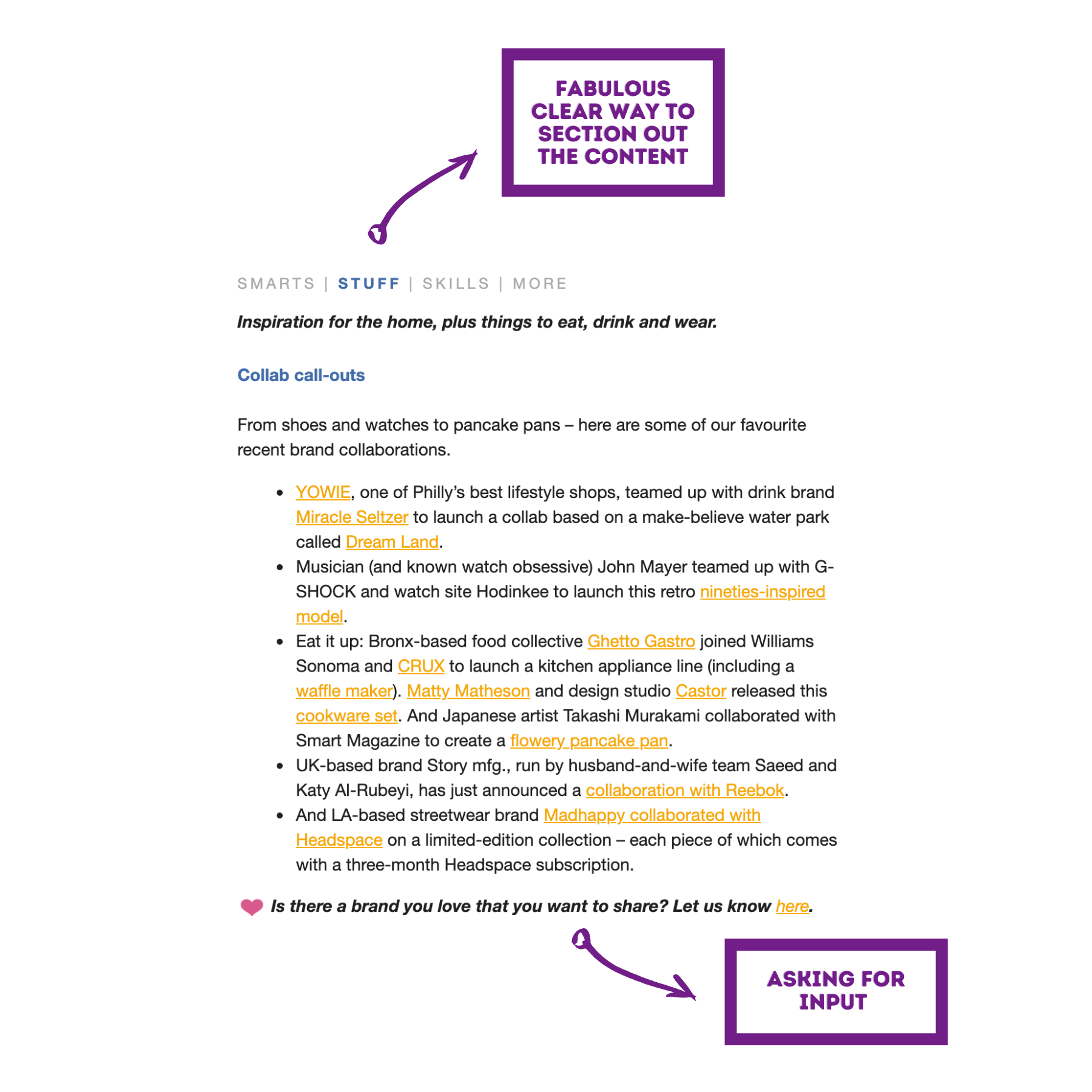
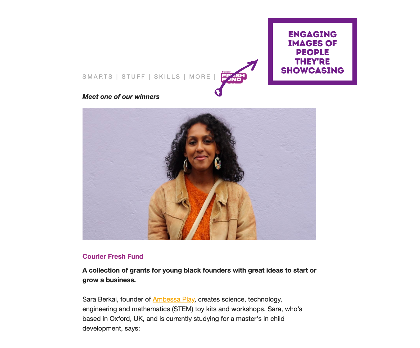
Of the 21 links in the first half of this most recent newsletter, 3 are to Courier- their Instagram, a survey and a link to see all the winners of their ‘Fresh Fund’. The other 18 are signposting people elsewhere.
And I like that.
Moving on...
In the ‘STUFF’ content category, they are giving people a platform, with links to Instagram profiles/posts, actual products, articles and brands. It’s all very curated and interesting.
I notice that in the whole email, there are no links to any Courier content on their website. And they don’t seem to have any…
Courier is trying to sell magazines and get podcast subscribers, so it makes sense that they don’t have much in the way of their own content on their website - they’d be giving away what’s in the magazine for free…
Notice at the end of this ‘STUFF’ section, they ask if I have any brands I’d like to share… I love that. This encourages a sense of collaboration and community.
Is the content brilliant? Does the writer come across as an expert?
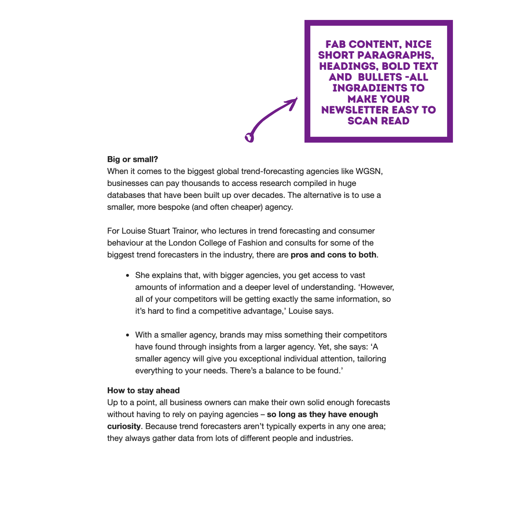
IT’S SO VARIED. It feels skilfully put together to really engage the reader.
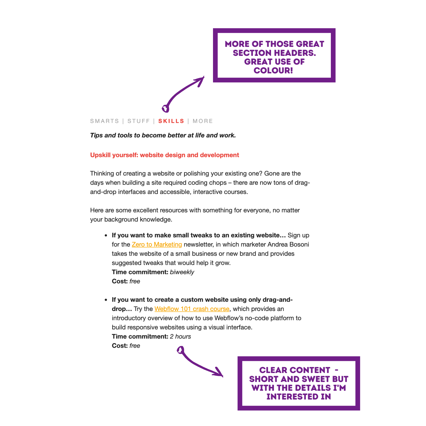
Take the ‘SKILLS’ section - for each of the resources, they share the time commitment and the cost. That’s in-depth info which their readers would like to know. Courier has their readers front of mind, and the description for each of the resources here is well written and clear too.
They’ve done their research, they are experts and I feel like their recommendations are to be trusted.
Is there structure?
It excellently structures as you can see from my screenshots.
I’d like to give a special shout out to the ‘MORE’ section. If you’re categorising your newsletter content, I really recommend having a section like this where you can pop in uncategorisable stuff - it’s likely to be the most interesting bit for some of your readers. Each of those 5 links have piqued my interest; their content is spot on.
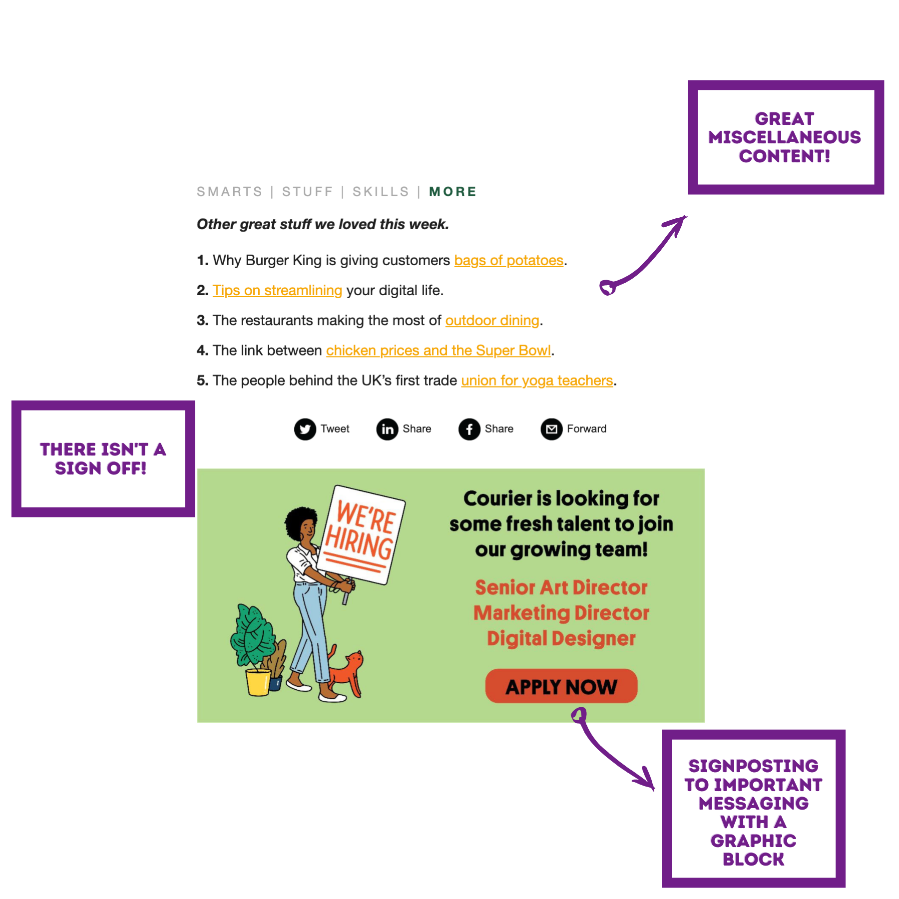
I love how they don’t push their magazine subscription in the newsletter - it kind of sells itself if I’m honest.
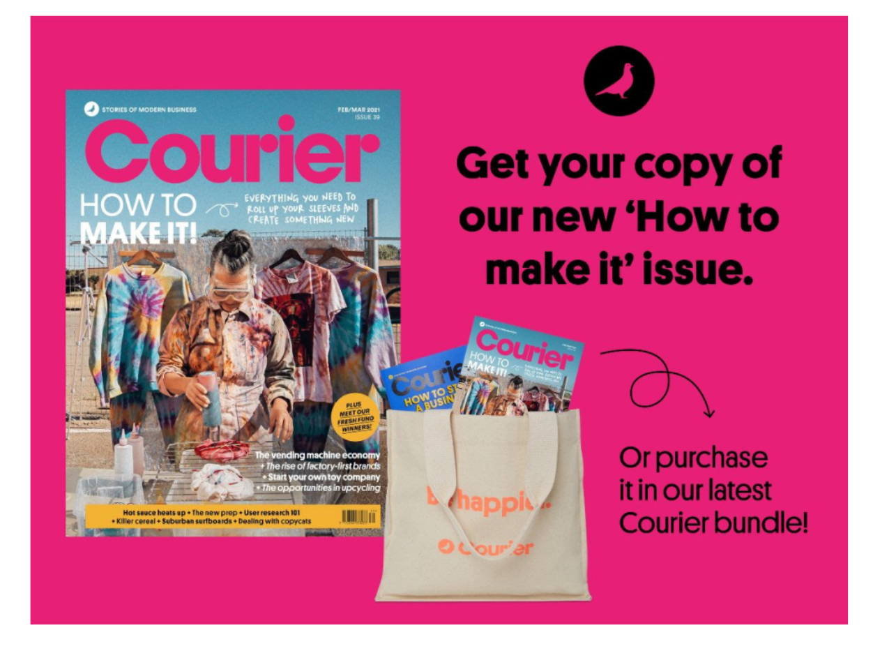
I did notice from previous editions of these weekly newsletters, that the graphic block at the end of the email does have a ‘buy our magazine’ section - here’s an example of what that looks like:
In summary
Your email newsletter is the perfect opportunity to give your audience what they want on a regular basis.
Having some insight into what will make it good and where you might trip up, are really important considerations to make before you start building your newsletter.
Here’s a little checklist for you to have to hand:
- Gather up some brilliant content which isn’t just a regurgitation of your blog or website. And make sure to find some great external stuff to include.
- Write something fresh - take a look at what the current trends are, have a nosey at what your audience is interested in and talking about.
- Make it personal! Ask for a first name in the sign up form so you can include it in the email. Send it from a real person (or make someone up if you have to!) and definitely include an email signature - preferably one with a picture of the sender.
- Make the email easy to scan read and consume using headings, clear sectioning, short paragraphs and bullets.
- Introduce brand colours and please, please include some nice relevant images or graphics.
- Rinse and repeat on a regular basis.
I mentioned at the beginning of the blog how quick my friends and family were to share their newsletter favourites...
Have that in the back of your mind - that’s what you’re aiming for. If people recommend and talk about your newsletter with some passion, you’re winning!
The 3 BIG takeaways
It’s not a newsletter if you’re just sharing a new blog post - that’s a new blog post notification!
It’s not a newsletter if you’re announcing a new product, that’s a new product announcement!
It’s not a newsletter if it’s a pure sales email!
Now you know what elements make a great newsletter and certain things you should avoid.
If you want some more guidance on creating engaging newsletters - have a look at our blog ‘How to write great newsletter content’. We list out all the different elements which make a newsletter GREAT.
Hopefully you have everything you need from this blog to go away and shape up your own newsletter.

Sign up to the Brainbox to stay in the loop with the latest marketing news and exclusive content
Or, if you have something specific in mind, reach out to us directly. We're all ears and ready to chat! Contact us here.

