Welcome to part two of my blog series where I share compelling email examples - real life, tangible examples of excellent pieces of email marketing.
This series is all about dissecting great emails to show you what works and what doesn’t.
No email is ever going to be perfect. Our preferences in communication will differ slightly from person to person. However, you’ll get an idea of best practices and some sparks of inspiration to move you forward in your email creation process.
In the first installment in this series, I looked at a welcome email that was sent by a home health testing service called Thriva. The email was sent to accompany the test kit that the consumer would have received.
It was a beauty, full of very engaging .GIFs which showcased their creativity, marketing prowess and lined me up to complete my kit. But they didn’t get it all right… Take a look at my teardown here.
Today, we’re looking at not one but two welcome emails from a lovely little brand called Kidly. They make beautiful things for children - clothes, toys and more.
Their welcome emails stood out to me because they sent the initial welcome email from James, the Managing Director and a second from the brand.
We like this personal approach!
If you’re anything like me, and love tangibility, you’ll find some inspiration and leave with either some robust email campaign ideas or some clear ways you could optimise your marketing emails, making them really shine, leading to more profitability from your marketing efforts.
Ready for teardown numero dos?
Let’s jump in!
Three quick compelling things
1. The copy is disarming - the friendly tone breaks down barriers and makes me feel confident to buy.
2. They’re simple and engaging in design - email one starts with a big lifestyle image and email two has lovely product shots that are well laid-out.
3. Email one is full of reasons to believe in the brand. I felt very compelled to purchase… (and I did).
Show us the welcome emails!
I signed up to emails from Kidly and the following is what I received over the next 3 days:
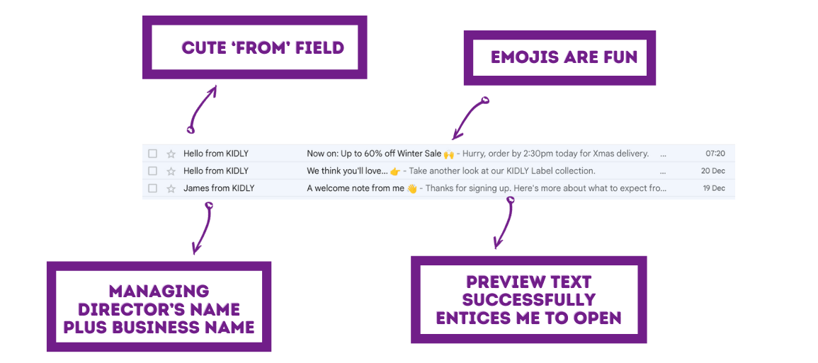
The first welcome email from ‘James’ was received immediately on signup.
The second welcome email was received 24 hours later.
The third email, received the day after the second welcome email, was a sales email.
I’m going to be looking at the first two emails in the welcome series. Let’s start with email one!
What makes this email compelling?
It’s a personal and genuine welcome email
I love that the sender of the email is ‘James from KIDLY’. Including both his name and the business name.
Similar to that in the ‘from:’ field of the email makes me understand who James is immediately, and I felt more compelled to open the email because it was from a person, not the biz as a whole.
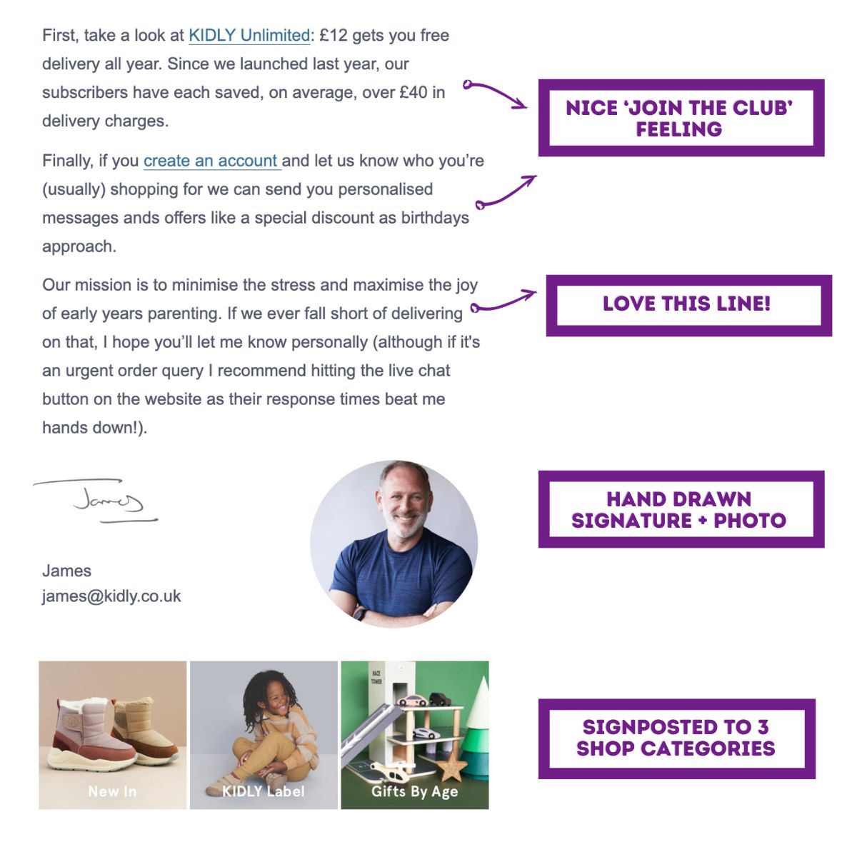
Inside the email, James has included a photograph of himself - excellent.
The placement of the photograph is well thought out too. Placing it at the bottom of the email in his sign off is clever. Consumers don’t really care who James is, it’s not important to them. So, it isn’t necessary to have multiple or higher up images of James - that would feel a bit ego-heavy to me. Sorry James
He also has a hand-written signature. This is a really small thing, but adds so much more of a human feel.
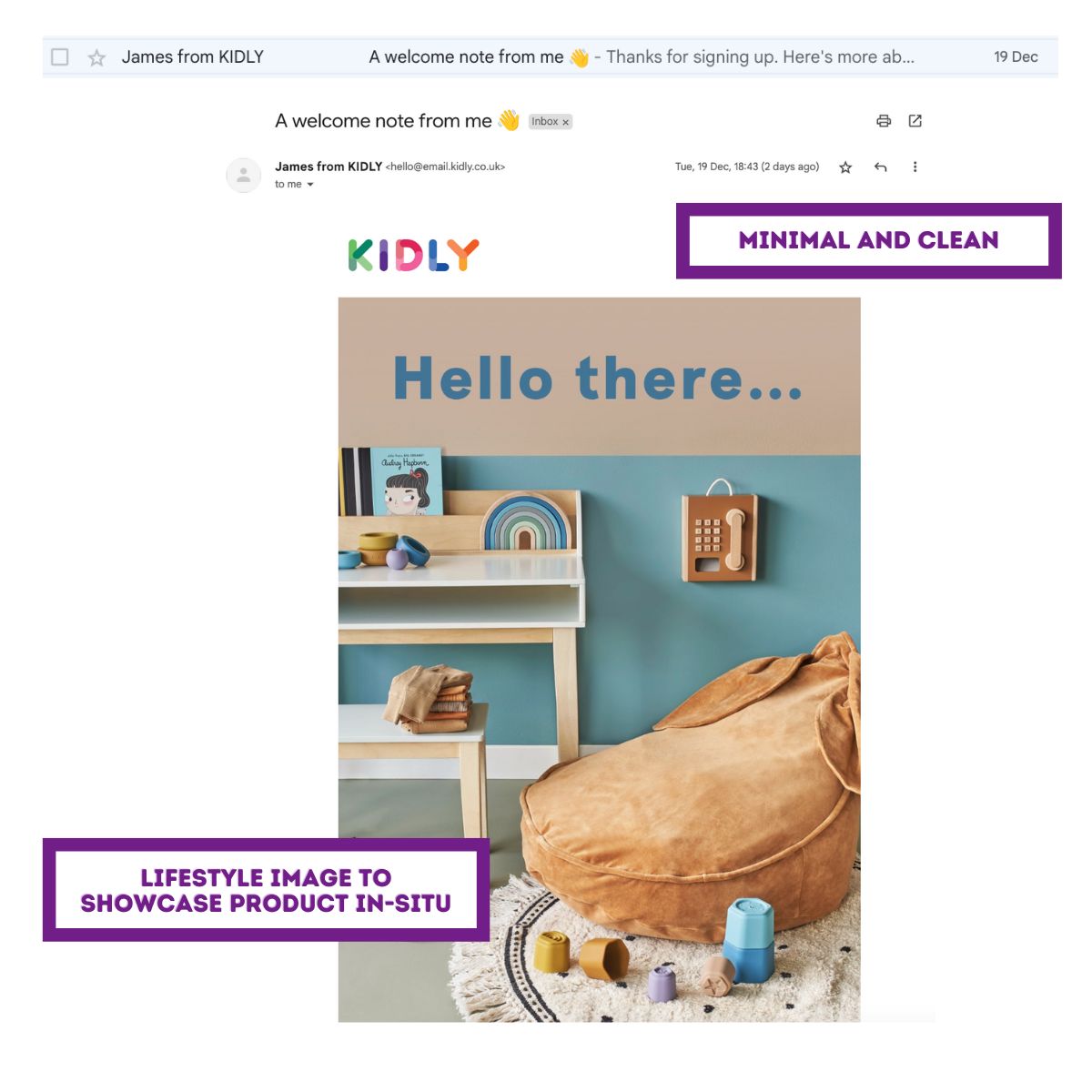
The lovely ‘Hello there’ at the top of the emails - I like it and I like that because it uses a background colour, it merges with the image below it. This helps the email flow better in my opinion.
The waving hand emoji in the subject line is another nod to the friendliness that they’ve conveyed so well through these emails.
I would bet that they split-tested the subject line to see if their audience responded well to the use of the waving emoji.
Split testing subject lines helps work out which version your audience prefers, allowing you to optimise future subject lines, leading to higher open rates. You can find more on that in this blog: Why Use Emojis In Email Subject Lines?
The tone that they’ve chosen for the copy is light and friendly, including a lot of us and we, rather than making it about him and his impact.
This part of the email is golden:
“Our mission is to minimise the stress and maximise the joy of early years parenting. If we ever fall short of delivering on that, I hope you'll let me know personally (although if it's an urgent order query I recommend hitting the live chat button on the website as their response times beat me hands down!).”
To have a business owner personally offer to help you out if something is amiss adds a really strong feeling of pride, integrity and good service to the brand. I know that it is unlikely that I would reach out to James with a query, but the offer is more than welcome and is excellent positioning.
That paragraph is super handy too - I know how to submit a query to get it sorted quickly.
Talking about their customer service in this way is a genuine and subtle way to inform you about their fast response times. Clever!
Simplicity
Look at that lovely design! A big lifestyle image up top to showcase the product being used (rather than actual product images which can feel a bit ‘hard sell’ in the first welcome email and that does blur the line between welcome and sales), then 8 short paragraphs of copy.
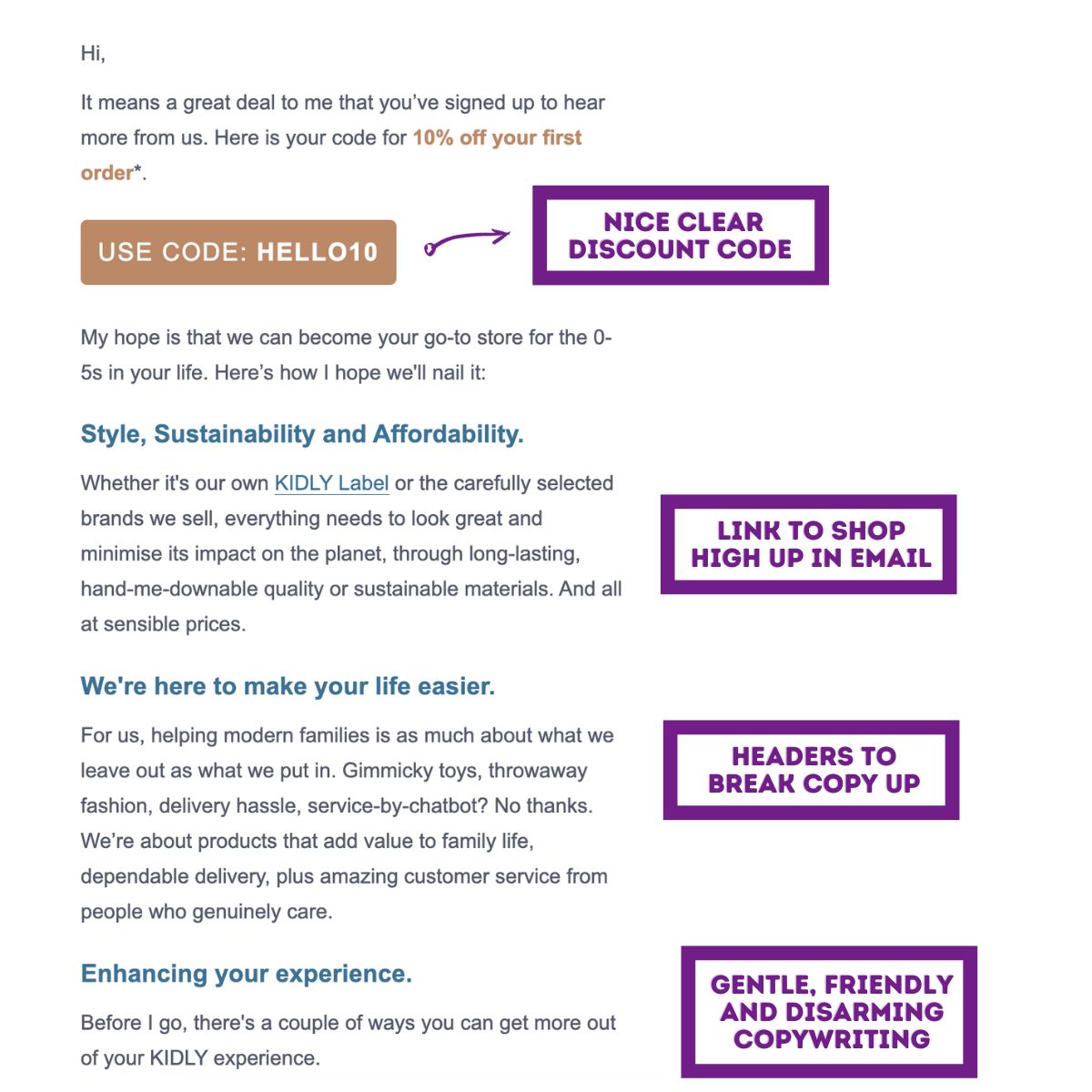
A nice big button shows the welcome discount and links directly to the shop. This shares the information some people want quickly - the discount code - they can access that with no scrolling or wading through text. Excellent.
Lookin' Good!
It’s a great user experience on both. The images in mobile view have good sizing and all text is displayed clearly. Big tick from me.
Clear Calls to Action
The button with discount links to the shop - yes! That’s the main CTA.
We also have a link to the ‘Kidly Label’ which feels subtle, and more an educational mention - ‘we have our own brand don‘t you know’ rather than a shouty ‘SHOP NOW!’ style of mention.
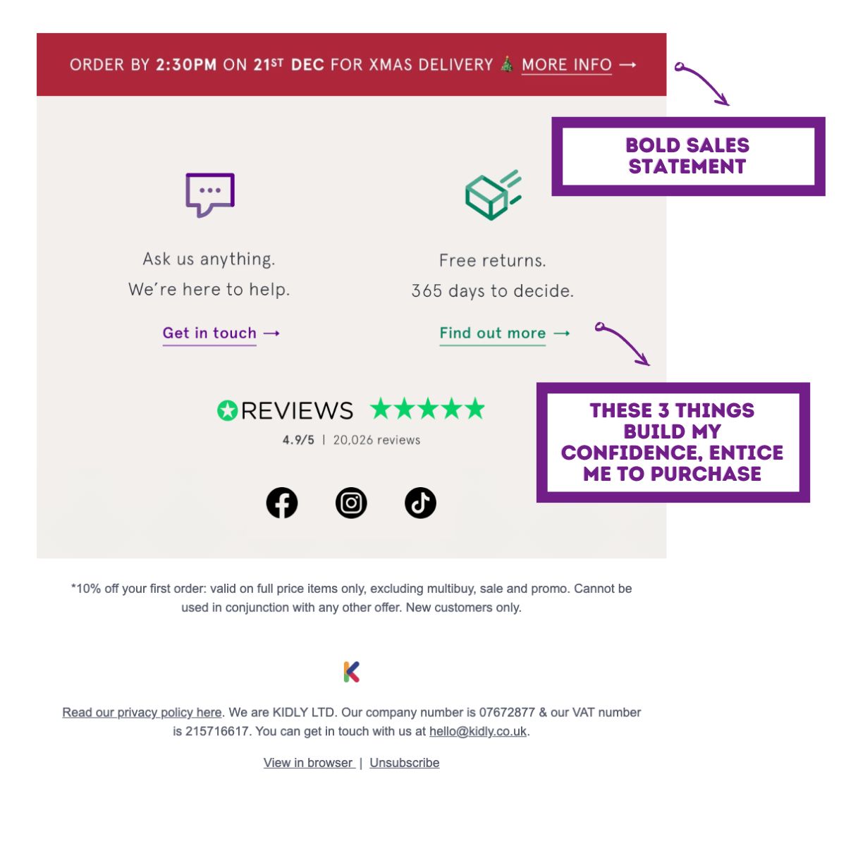
The other calls to action come at the end of the email - those 3 boxes have clarity, look great, and compel me to click.
My favourite CTA comes below those boxes in the form of a red button. The choice of the colour red is apt as it draws attention easily. And, yes - I did want delivery in time for Christmas. Thank you for letting me know the delivery parameters!
Again, it doesn't have a pushy sales feel to it, and I like that.
A Welcome Email That Builds Confidence
The copy in the email is welcoming and soft. Beautifully done. As I read, I am put at ease. Any resistance I had to purchasing has melted away, and the copy and approach - having the email sent from James himself - fosters a sense of openness.
This is a welcome email at its best in terms of tone - you want the audience to feel comfortable, breaking down barriers and creating a connection with the reader. The friendly and approachable tone adds to this.
The email also includes ‘reasons to believe’ those three points at the bottom of the email:
‘Ask us anything’ we’re here to help > get in touch’
Free returns. 365 days to decide > find out more
Reviews - 5 stars
The inclusion of the five star review icon is strong social proof - ‘other people believe in this brand so I should too’.
Depending on their email marketing platform, this may be a clever little widget which shows their star rating and auto updates with the statistics.
How could they make this email better?
While this is a teardown, I do have to admit - I don’t think there is much more they could have done to make it better.
Since I’m in the business of being a bit picky, my only grievance would be that I wish the email had been personalised.
Kidly didn’t ask for a first name in the email sign up form and so, it wouldn’t have been possible. The email opens with ‘Hi’. To me, that feels a little blunt.
A small tweak to ‘Hi friend’ or ‘Hey there’, would have made it feel much warmer.

Email Number Two
Here’s what we’re working with:
What works in email number two?
Short And Sweet
This email was very short and sweet. (I haven’t included the footer part because it was the same as in email 1 - below the product images you can see above there was the section of ‘reasons to believe’ and usual footer gumph).
Because email 1 from James was so compelling, I quite like that this email took a more product-based approach. The succinctness shone in email one and I don’t need a repeat of that info. The email did its job. I’m ready to become a customer, and I just want to see what’s on offer.
A Gentle Reminder
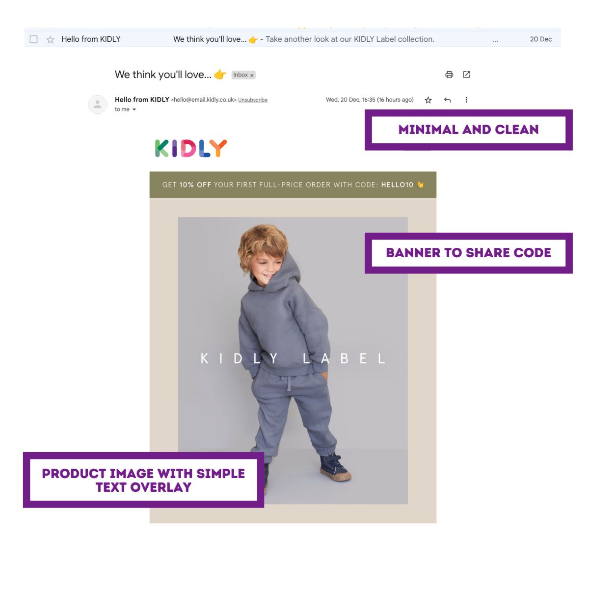
The clickable banner at the top of the email is a great nudge and reminder to use that 10% welcome discount. Can you see how the green and beige colours are nice warm, subtle colours? I like that.
One Product Image
The email starts with a product image of a child in cute sweats. It’s a simple and charming product shot. The button was clickable and took me to the correct category. Simple!

No Hard Sale Messaging
Your welcome emails are not the place to push push push. You’re building a relationship here. But every business is different, and businesses shouldn’t pretend they don’t have things for sale!
This email does have a fair few product showcases, but it doesn’t feel pushy. Here’s why:
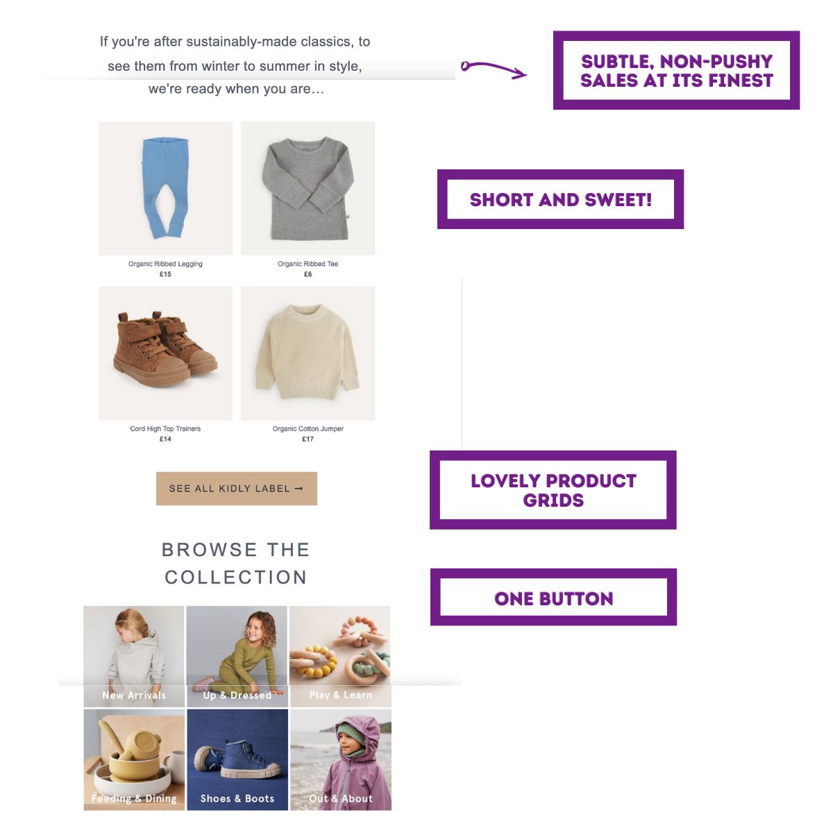
- The copy: “if you’re after sustainability-made classics, to see them from Winter to Summer, we’re ready when you are” - isn’t that great? they’re ready for you to purchase when you’re ready. I LOVE THIS COPY. Everyone, you should use this!
- The button: you can imagine it may say ‘shop now’ in a sales email, but Kidly use the words “See all Kidly Label '' which is kind of the same thing, but gently gently does it! This is also reflected in the ‘browse the collection’ messaging below.
- The email only includes that one button. No need to overegg it. Keep it simple and gentle.
Places To Improve Email 2
There isn’t a sign-off, and that loses Kidly some points from me. A goodbye nod from the brand - rather than the email just ending below those collection product blocks - would make it feel more human, and could be a great spot for a touch of the welcoming copy we saw in email one - just a little sprinkle, a paragraph or two. That’s all I want!
And that’s all. I loved this email.
But it’s important for me to spell out that I loved this email in conjunction with email 1.
If I just got this singular “we think you’ll love” welcome email from the brand, and no email from James the day before, It would feel cold and totally impersonal.
Sure, I like the products, but I wouldn’t feel compelled to purchase them.
The emails coming one after the other is what works.
So, consider this - perhaps your welcome email campaign could start with a very personal email from the CEO, and then followed by emails from the brand… The first email does the heavy, personal lifting. It’s an approach which really worked for Kidly.
Taking Notes From Kidly
So, to summarise how Kidly have smashed their welcome emails:
- Kept the design simple
- One big image which showcases your product in a gentle way
- Inspire action by making the discount code a button
- Use gentle colours - save bright colours for important messaging - like Kidly did for the Xmas delivery banner in email one
- Disarm your reader by creating copy with a genuine, friendly feel
- Include reasons to purchase
- Include social proof
- Make it look good on both desktop and mobile view
To Crafting The Perfect Welcome Emails!
Onward! I hope you have found this useful. I love it when perfect little emails like these drop into my inbox and I love creating these teardowns.
If you’ve received an email and want me to do a little teardown of it, drop us a line - you can contact us here.


