It’s time for another email teardown! This time, we're looking at welcome emails that I received from Revolution Beauty.
I love doing this series - I’m all about tangibility, real examples and honest opinions from an email marketer (moi), that will lead you to creating the welcome emails of your dreams.
In this email teardown, we’ll find missed opportunities, a feeling of neediness and a powerful GIF.
Let’s take a closer look at how this brand welcomes its newest prospects - is it warm? Is it personal? (spoiler alert: no and no!)
While there was some stuff within the email that worked well, I found plenty that was missing the mark.
Let’s Get Dismantling!
I recently signed up to email marketing from Revolution Beauty.
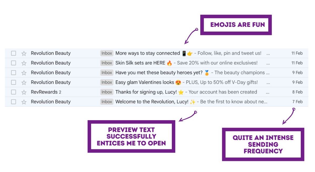
Here’s a screenshot of how their emails have landed in my inbox. You can see the sending frequency here - it felt a bit intense.
How Did The Emails Land?
I signed up on the 7th Feb. I received six emails from then until the 11th Feb. 6 emails in 5 days. That’s a lot - they were popping up in my inbox way too frequently. It felt like white noise.
When I received the emails, it was very close to Valentine’s Day, a significant event in the beauty industry.
But, when it comes to a welcome series, you have to weigh up the impact of ‘bombardment’ on any new sign up. The first emails they receive should have a gentle approach, with a buffer to shield them from sales.
Which Emails Were From Their Welcome Campaign?
In terms of what’s part of the welcome campaign and what’s sales, it goes a little like this:
- Email 1: Welcome to the Revolution, Lucy! - Welcome email 1
- Email 2: Thanks for signing up, Lucy! - Welcome email 2 (sent twice, two emails at identical times. They made an error here)
- Email 3: Easy glam Valentines looks - Sales email 1
- Email 4: Have you met these beauty heroes yet? - Welcome email 3 (this is the email I’m dissecting in this blog)
- Email 5: Skin Silk sets are HERE - Sales email 2
- Email 6: More ways to stay connected - Welcome email 4
Revolution Beauty chose to combine both sales and welcome within their emails. (Something which we do not recommend).
All but one of the emails are sent from ‘Revolution Beauty’ which is nice and clear, but I do like there being something a bit more human in welcome emails - In a different blog in this series, I especially liked how one email was sent from the CEO of Kidly.
- Read more here: Compelling Email Examples: Part 2
One email in the list above was sent from ‘RevRewards’ - this one felt a bit jarring as I haven’t yet purchased anything - I think reward schemes are best saved until people become customers.
This put me off a little if I’m honest, and it backed up how I felt like they’re a bit needy/desperate. Emails like this, which share a rewards scheme, belong in an ‘onboarding campaign.
- Related Content: What should every Onboarding campaign contain?
How Were The Subject Lines?
They’re pretty compelling - so all good here.

Maybe I’m just not Revolution Beauty’s target audience, but I have no interest in following them across socials.
It feels like there wouldn't be much point in that - they’re already in my emails, which is about as intimate as it can get, so why would I want to follow them on Twitter?
And why is one whole email being devoted to this?!
Sometimes when brands do this it feels more like we’re being asked to do them a favour, which is a no no for any welcome campaign. Social pokes are best kept within emails; if I want to follow them, I will.
How Does This Welcome Email Begin?
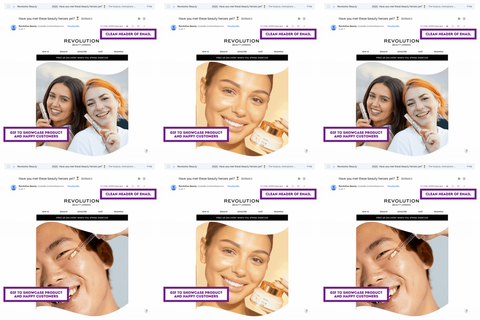
The very top of the email contains:
Logo
Navigation to shop categories/web pages
Promo banner for free UK delivery
It’s a small space containing a lot of good stuff - I like this email header a lot. The following GIF commands attention, so the top of the email must be minimal and sharp. Success!
The GIF is great. Happy faces, products being used, a range of models. It feels happy and friendly.
The promo banner is a subtle spot for sales messaging - this feels ok in a welcome email. Although it is taking up prime real estate in the email, it’s gentle and gives a reason to shop.
Onto The ‘Hall of Fame’ Product Sharing
What you are about to see is a LOT of sales messaging. This would feel fine if I had been on their list for a while. More so if I was a customer and already trusted the brand, but this is a welcome campaign, and I feel like I’m being sold down the river (literally).
How does this content make you feel?
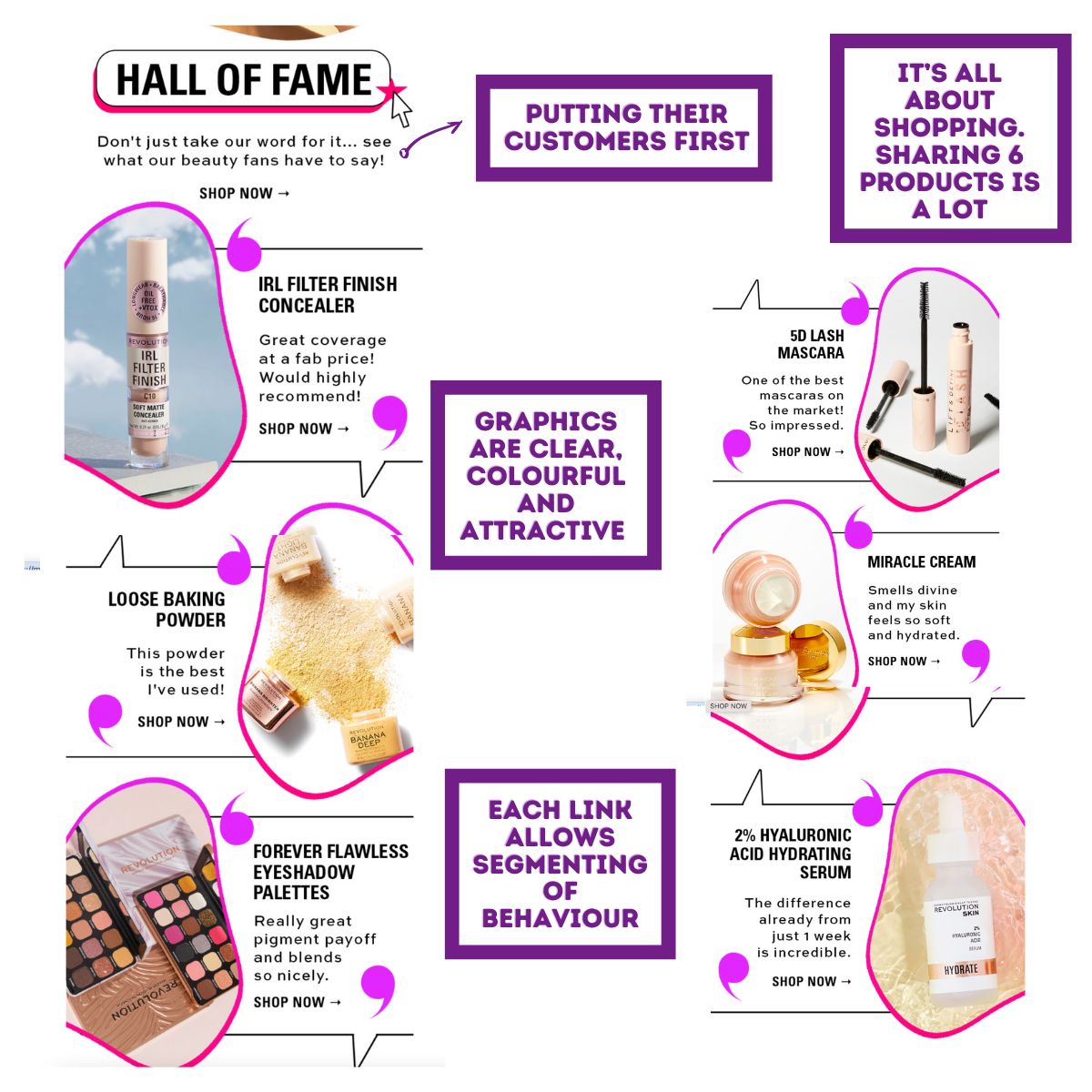
Six products!
That's not welcome content, that's pure sales content (and there's not much else in this email, we're pretty much at the end).
I like that they're sharing reviews of their customers, and I appreciate how the email looks - on-brand, bright, colourful and fun.
Each link goes through to the relevant product successfully. This gives Revolution Beauty the ability to track the link clicks, leading to customer segmentation.
For example, if I clicked on the foundation, they would know I'm interested in foundations as a makeup product and could share more options with me in a future sales campaign.
A Mobile-First Welcome Email
I noticed that the email is very mobile-first. So much so that it looks bad when I open it on a desktop. Mobile first is great, and I recommend they make the images a little smaller for the desktop view (if their marketing automation system allows) so they’re not HUGE on a desktop.
How Does The Email End?
Abruptly!
There is no text, just this black banner sharing their socials. It’s a real missed opportunity to add something personal and/or give something of value. It feels incredibly cold, the opposite of a warm welcome. I think Revolution Beauty has work to do.
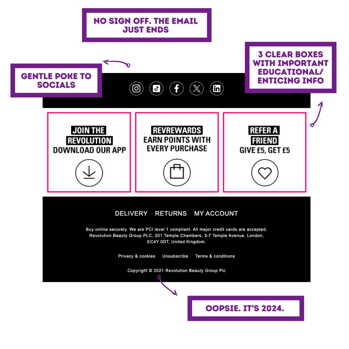
What’s good? The three boxes are useful, and a little sales push which suits being at the end of an email, in this format. But that’s all I’m giving them.
One final thing I noticed is the ‘2021’ date on the email footer. Now that’s sloppy. I think Revolution Beauty needs a Ninja!
What Should Every Great Welcome Campaign Include?
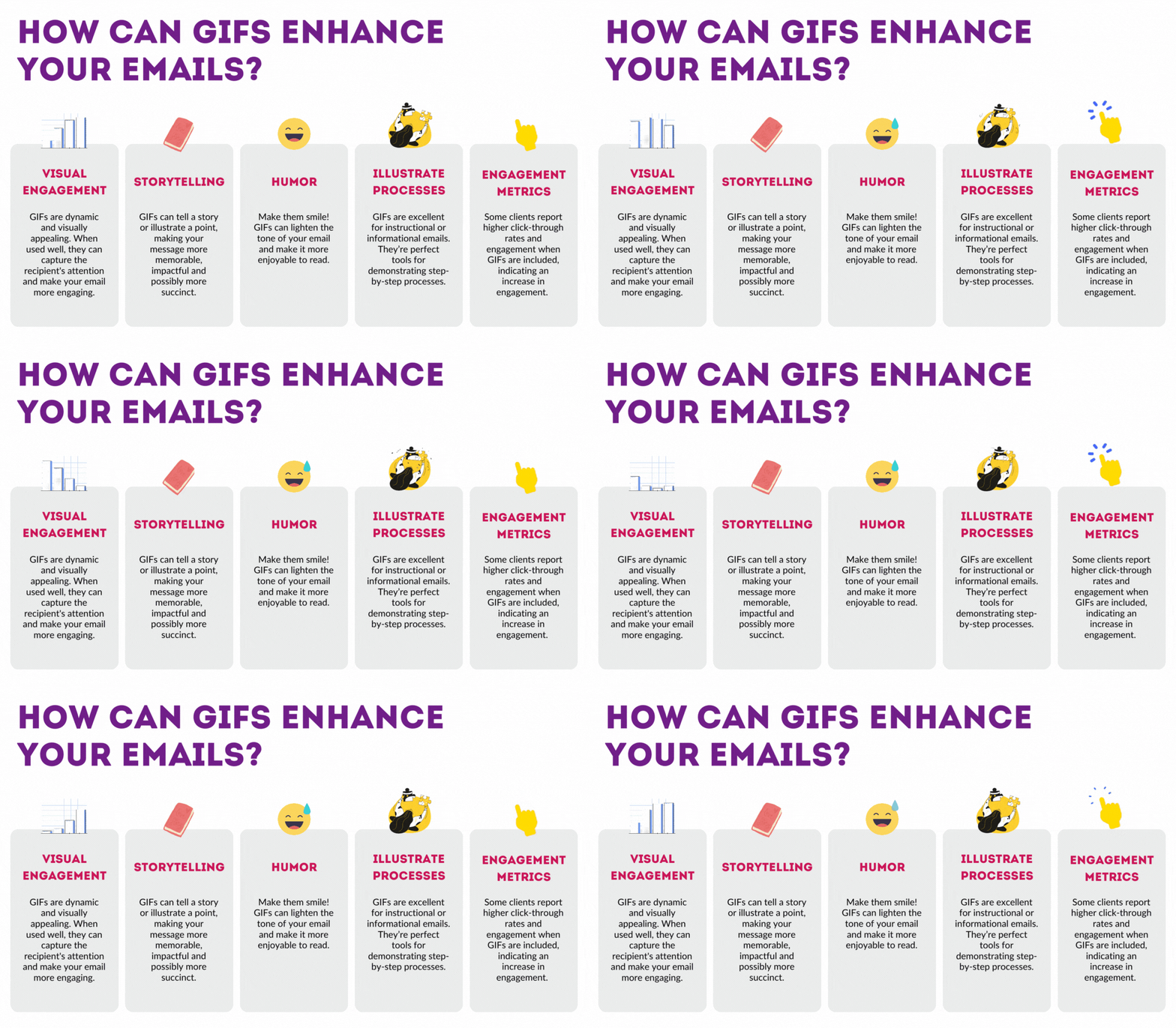
I put together this graphic to quickly share what welcome campaigns should include (taken from: What Is A Welcome Email Campaign?)
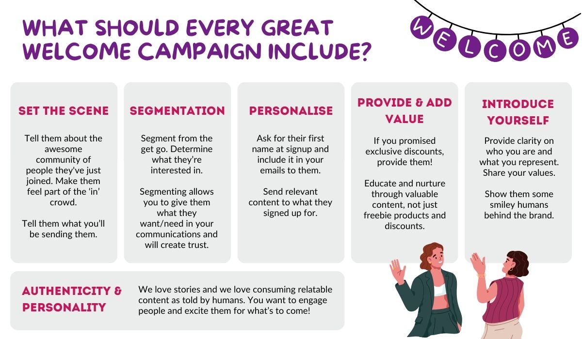
If we go through that list and compare it to Revolution Beauty’s welcome email, they’ve really missed the mark.
A quick look at their website brought this up:
“Discover the home of Makeup Revolution and shop award winning make up, skincare and haircare. Incredible, cruelty free beauty. Made affordable.”
Now doesn’t that sound great! There’s lots there they could thread into this welcome email. Being cruelty free is a big important value! And so is being affordable - obviously that’s something that the customers LOVE.
If they had included some copy around these values, I would have been so much more engaged and they would have felt like so much more than a company shilling makeup.
So there we have it, a pretty bad welcome email example. I feel like I've been deterred from engaging before I even get started with this brand.
A less extreme reaction may be indifference - nothing stood out, nothing was memorable, I haven't connected with the brand or understood who they are, so their emails are destined for a swipe into the trash before even opening.
A welcome campaign shouldn't be about selling. Your prospects aren't ready to buy at this point in their customer journey. This email was one of the first points of communication, and they've turned me off.
Revolution Beauty, if you're reading this and want to know how to create engaging welcome emails that provide value and create raving fans, you know where we are. We'd love to help.


